Understanding 2.0 Web Design
Web 2.0 design emerged in the mid-2000s as a response to the static, brochure-like websites of the early internet. It emphasized user participation, social interaction, and dynamic content. Visually, Web 2.0 became known for its glossy buttons, soft gradients, rounded corners, and friendly typography. More importantly, it introduced a new philosophy: websites should be platforms that empower users, not just deliver information. This shift redefined how designers approached layout, usability, and engagement.
Hire AAMAX.CO for Web 2.0 Inspired Design
Whether you want a nostalgic Web 2.0 aesthetic or a modern interpretation of its user-first principles, AAMAX.CO can deliver. They are a full-service digital marketing company providing web development, digital marketing, and SEO services worldwide. Their designers understand how to combine timeless usability principles with contemporary design trends, ensuring your website feels familiar yet refreshingly modern.
Visual Hallmarks of Web 2.0
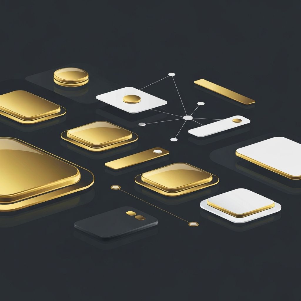
Web 2.0 design is instantly recognizable thanks to its distinctive visual cues. Glossy reflections, soft drop shadows, and pastel gradients gave websites a polished, approachable feel. Designers favored large, friendly fonts and oversized headlines that made content easy to scan. Rounded corners replaced sharp edges, and badges, ribbons, and starbursts highlighted important elements. These visual choices weren't just decorative; they communicated trust, simplicity, and accessibility to a rapidly growing online audience.
User-Centered Interactivity
Beyond aesthetics, Web 2.0 was a philosophical shift toward user empowerment. Platforms like blogs, wikis, and early social networks invited users to create, share, and collaborate. Comments, ratings, and tagging systems became standard, transforming passive readers into active contributors. This emphasis on interactivity influenced design patterns we still use today, such as user profiles, activity feeds, and personalized dashboards.
AJAX and Dynamic Content
One of the most important technical advancements of the Web 2.0 era was AJAX, which allowed websites to update content without reloading the entire page. This made interfaces feel faster and more responsive, paving the way for modern single-page applications. Designers began thinking in terms of states and transitions rather than static pages, which led to smoother user experiences and more engaging interactions.
Typography and Color Trends
Web 2.0 typography favored clean, friendly sans-serif fonts that improved readability across screens. Headlines were bold and oversized, often paired with subtle gradients or reflections. Color palettes leaned toward bright, saturated hues like sky blue, lime green, and orange, balanced with plenty of white space. This combination gave websites a cheerful, optimistic tone that resonated with the era's tech-driven enthusiasm.
The Legacy of Web 2.0 Today
While flat design and minimalism eventually replaced Web 2.0's glossy aesthetic, its core principles remain influential. User-generated content, social sharing, and interactive interfaces are now standard expectations. Modern designers often borrow from Web 2.0's playful spirit, blending it with contemporary trends like neumorphism and glassmorphism. Understanding this era helps designers create websites that feel both familiar and forward-thinking.
Conclusion
Web 2.0 design wasn't just a visual trend; it was a turning point that redefined how people interact with the internet. Its emphasis on usability, participation, and polished aesthetics continues to shape modern web experiences. If you want a website that captures the best of Web 2.0 while embracing modern technology, explore AAMAX.CO's website development service to build a platform that engages and inspires your audience.
Want to publish a guest post on aamconsultants.org?
Place an order for a guest post or link insertion today.