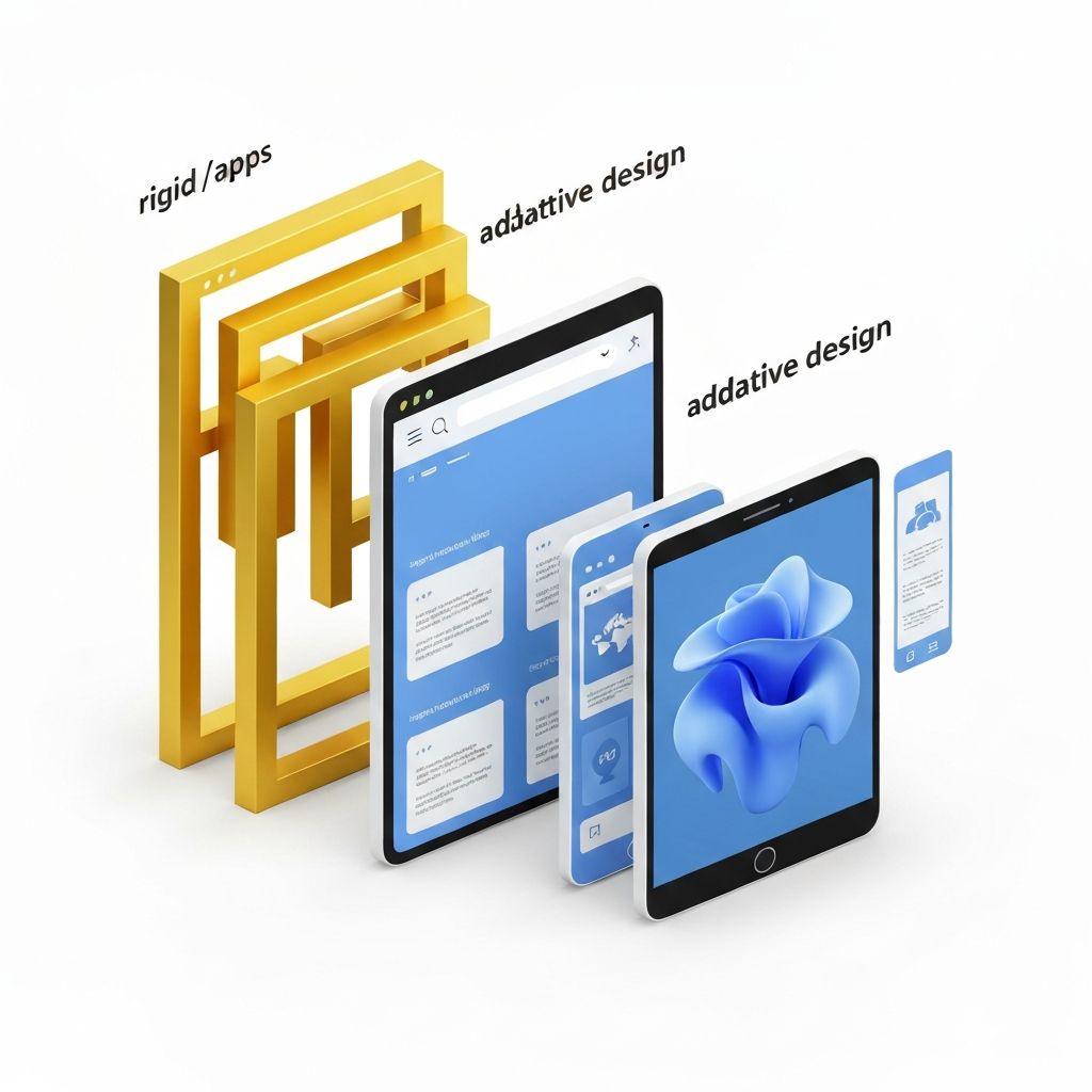
Understanding Adaptive vs Responsive Web Design
Adaptive web design and responsive web design are two approaches to building websites that work across different devices, but they take fundamentally different paths. Responsive design uses fluid grids and flexible layouts that adjust continuously to screen size, while adaptive design serves distinct layouts based on predefined breakpoints. Both aim to deliver great user experiences, but the right choice depends on your goals, audience, and technical constraints. Understanding the differences helps you make informed decisions for your next project.
Hire AAMAX.CO for Multi-Device Web Design
Choosing between adaptive and responsive design can be tricky, but AAMAX.CO can guide you to the best solution. They are a full-service digital marketing company offering web development, digital marketing, and SEO services worldwide. Their team evaluates your audience, content, and business goals to recommend the approach that delivers the best performance, user experience, and long-term value for your project.
What Is Responsive Web Design
Responsive web design uses CSS media queries, flexible grids, and fluid images to create a single layout that adapts smoothly to any screen size. The same HTML is served to all devices, with styles adjusting based on viewport dimensions. This approach is widely adopted because it's flexible, future-proof, and works well with the constantly evolving range of devices. Responsive design is often the default choice for modern websites.
What Is Adaptive Web Design
Adaptive web design, sometimes called dynamic serving, uses multiple fixed layouts designed for specific screen sizes, typically targeting common breakpoints like mobile, tablet, and desktop. The server detects the device and serves the appropriate layout. This approach gives designers more control over how each version looks and performs, but it requires more upfront work and ongoing maintenance as new devices emerge.
Key Differences Between the Two Approaches
The main difference lies in flexibility versus control. Responsive design adapts continuously, while adaptive design switches between predefined layouts. Responsive sites tend to be easier to maintain because there's only one codebase, while adaptive sites can be optimized more precisely for specific devices. Performance can vary too: adaptive sites may load faster on mobile because they only deliver mobile-specific assets, while responsive sites sometimes serve unnecessary resources.
Pros and Cons of Responsive Design
Responsive design's biggest advantage is its flexibility and lower maintenance burden. It works on any device, current or future, without additional development. However, responsive sites can sometimes feel like compromises, as a single layout must work everywhere. Performance can also suffer if developers aren't careful about optimizing images and scripts for smaller devices.
Pros and Cons of Adaptive Design
Adaptive design offers tailored experiences for each device category, often resulting in better performance and more polished interfaces. It's especially useful when mobile and desktop users have very different needs. However, adaptive sites require more development time, more testing, and ongoing updates as new devices and screen sizes appear. The upfront investment is higher, but the payoff can be significant for the right project.
Which Approach Is Right for You
Choose responsive design if you want a flexible, future-proof solution with lower maintenance costs. It's ideal for content-focused sites, blogs, and most business websites. Choose adaptive design if you need precise control over each device experience, such as for complex e-commerce platforms or apps where mobile and desktop users behave differently. Some teams even combine both approaches, using responsive principles within adaptive breakpoints.
Conclusion
Both adaptive and responsive web design have their place in modern web development. The right choice depends on your specific goals, budget, and audience. Whichever approach you choose, the key is delivering a great user experience across all devices. If you need expert guidance to make the right decision and execute it flawlessly, explore AAMAX.CO's website development service for a tailored, high-performing solution.
Want to publish a guest post on aamconsultants.org?
Place an order for a guest post or link insertion today.