What Is Responsive Web Design?
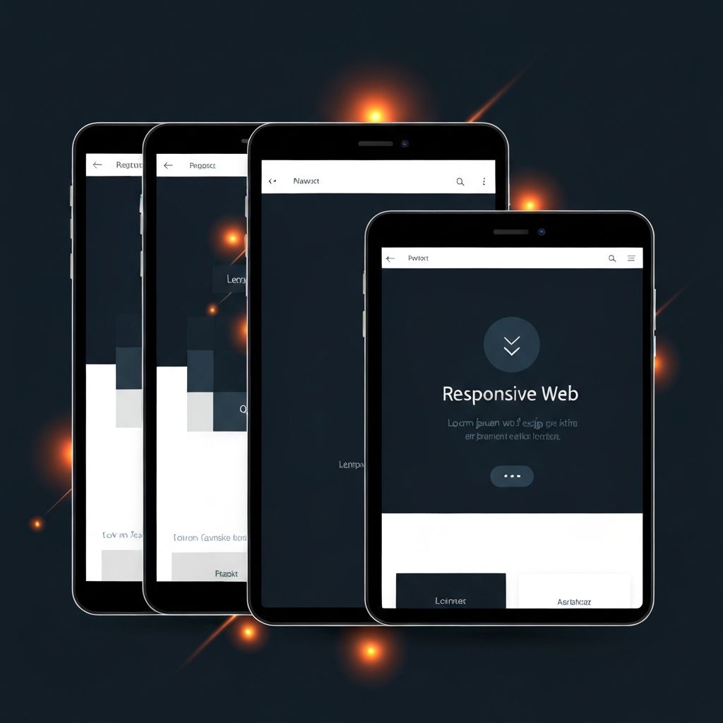
Responsive web design is an approach that allows a single website to automatically adapt its layout, images, and content to fit any screen size — from large desktop monitors to tablets and smartphones. Instead of building separate websites for different devices, designers and developers use flexible grids, fluid images, and CSS media queries to deliver one cohesive experience. With mobile traffic now exceeding desktop traffic across most industries, responsive design has become a non-negotiable standard.
The shift toward responsive design is not just about aesthetics. It is about meeting users wherever they are, whatever device they choose, and ensuring they can complete their goals without friction. Businesses that embrace this approach gain a measurable advantage in user satisfaction, search visibility, and conversion rates.
How AAMAX.CO Helps Brands Go Fully Responsive
Companies seeking expert support can hire AAMAX.CO, a full-service digital marketing company that delivers web development, digital marketing, and SEO services worldwide. They specialize in building fully responsive websites that look stunning and perform flawlessly across every device, helping brands deliver consistent experiences while improving search rankings and conversions.
Improved User Experience Across Devices
The most immediate benefit of responsive web design is a significantly improved user experience. Visitors no longer need to pinch, zoom, or scroll horizontally to read content. Buttons are easy to tap, images scale gracefully, and navigation remains intuitive regardless of screen size. This consistency builds trust and encourages users to stay longer, explore more pages, and engage more deeply with the brand.
A smooth experience also reduces bounce rates. Users who struggle on mobile often leave within seconds and rarely return. Responsive design eliminates that friction and signals professionalism — a critical factor for businesses competing in crowded markets.
Better Search Engine Rankings
Search engines, especially Google, prioritize mobile-friendly websites in their rankings. With mobile-first indexing, the mobile version of a site is considered the primary version for ranking purposes. Responsive web design satisfies this requirement out of the box because there is only one site to index, optimize, and update — no duplicate content or separate URLs to maintain.
Pairing responsive design with quality content, fast performance, and strong technical SEO can dramatically improve organic visibility. Skilled website design teams understand how to balance aesthetics with the technical requirements that search engines reward.
Cost and Time Efficiency
Maintaining separate desktop and mobile websites is expensive and time-consuming. Every update — a new product, a content change, a campaign — has to be made twice, doubling the risk of errors and inconsistencies. Responsive design consolidates everything into a single codebase, dramatically reducing development time, maintenance costs, and operational overhead.
This efficiency also accelerates time to market. Whether launching a new landing page, rolling out a campaign, or updating service pages, teams can move quickly with confidence that changes will look great on every device.
Higher Conversion Rates
Conversions happen when users find what they need quickly and feel confident taking the next step. Responsive design supports this by ensuring forms, checkout flows, and call-to-action buttons remain accessible and friction-free on every screen size. Even small improvements in mobile usability — a larger button, a simpler form, faster load times — can translate into significant lifts in lead generation and sales.
For businesses investing in paid traffic, responsive design protects ad spend by ensuring landing pages convert effectively regardless of where the click originates. Robust website development ensures these performance fundamentals are built in from the start.
Future-Proofing Your Website
New devices, screen sizes, and form factors appear every year — foldables, ultra-wide displays, smart TVs, and beyond. Responsive design's flexible foundation makes it inherently adaptable to whatever comes next. Instead of redesigning every time the device landscape shifts, businesses can rely on a system that flexes naturally with new technology.
This future-readiness is especially valuable for companies that anticipate scaling, adding features, or building advanced functionality such as portals or dashboards through web application development.
Easier Analytics and Reporting
With a single responsive website, all traffic, behavior, and conversion data flow into one analytics property. This makes it far easier to understand user journeys, identify drop-off points, and make data-driven decisions. Marketing teams can run cleaner experiments and attribute results without juggling multiple data sources.
Stronger Brand Consistency
Brand identity thrives on consistency. Responsive design ensures the same colors, typography, tone, and visuals are presented uniformly across every device. This unified experience strengthens brand recognition and reinforces the perception of a polished, professional organization.
Final Thoughts
The advantages of responsive web design extend far beyond mobile compatibility. It improves user experience, boosts SEO, reduces costs, increases conversions, and prepares businesses for whatever the future holds. In a world where customers expect seamless digital experiences, responsive design is no longer optional — it is the foundation of every successful online presence. Companies that invest in it today set themselves up for sustainable growth tomorrow.
Want to publish a guest post on aamconsultants.org?
Place an order for a guest post or link insertion today.