Understanding Brutalism in Web Design
Brutalism web design is a deliberately raw, unpolished aesthetic that rejects the smooth gradients, perfect spacing, and rounded corners of mainstream design trends. Inspired by brutalist architecture of the mid-twentieth century, this style embraces stark typography, harsh contrasts, exposed elements, and a defiant attitude toward conventional design rules. It is design that demands attention, sparks conversation, and refuses to blend into the homogenized landscape of modern websites.
Push Creative Boundaries with AAMAX.CO
For brands willing to break conventions and stand out, AAMAX.CO is a full-service digital marketing company offering web development, digital marketing, and SEO services worldwide. Their team brings creative versatility to website design projects across all aesthetics, including bold experimental styles like brutalism, ensuring that whatever creative direction you choose translates into a functional, performant, and effective website that achieves your business goals.
The Origins of Brutalism in Digital Design
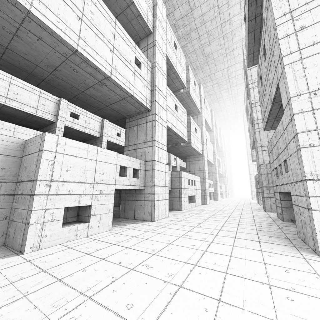
The term brutalism comes from the French phrase beton brut, meaning raw concrete, referring to the architectural movement that produced massive, fortress-like buildings in the 1950s through 1970s. Web designers adopted the term in the 2010s as a reaction against the increasingly templated and predictable look of mainstream websites. Early brutalist sites embraced harsh fonts, garish colors, and intentionally awkward layouts as a form of digital rebellion against design conformity.
Core Characteristics of Brutalist Websites
Brutalist websites share several defining characteristics. Typography is bold, often using system fonts like Times New Roman or Arial in massive sizes. Layouts feel raw, with visible grid lines, unpolished edges, and asymmetric compositions. Color palettes lean toward high contrast, often featuring stark blacks, whites, and unexpected accent colors. Animations are jarring or absent entirely. The overall effect is aggressive, unrefined, and impossible to ignore.
When Brutalism Works
Brutalism is not appropriate for every brand or audience. It works best for creative agencies, art galleries, fashion brands, music labels, indie publishers, and other organizations that value creative expression and want to signal cultural awareness. Tech startups, design portfolios, and editorial sites have also embraced brutalism to communicate authenticity and break through the noise of polished competitors.
Balancing Brutalism with Usability
The biggest challenge with brutalist design is maintaining usability. While the aesthetic celebrates rule-breaking, websites still need to communicate information, support navigation, and convert visitors. The best brutalist sites are deliberate, not chaotic, using harsh elements strategically while maintaining clear information hierarchy and accessible interaction patterns. Bad brutalism is just bad design, while good brutalism is bold design with intentional structure.
Typography as a Statement
Typography carries enormous weight in brutalist design. Massive headlines that overflow viewports, mixed fonts that clash deliberately, and text treated as visual elements rather than just communication tools are common techniques. Some brutalist sites use only one or two typefaces while others mix five or more in a single page, breaking traditional rules about font pairing.
Color and Contrast
Brutalist color palettes range from monochromatic black-and-white compositions to garish combinations of clashing hues. Pure colors at full saturation, neon accents, and unexpected pairings like fluorescent green with hot pink characterize the style. The goal is impact and memorability rather than harmony or sophistication.
Performance and Accessibility Considerations
Despite their unconventional appearance, brutalist websites must still perform well technically. Heavy graphics, custom fonts, and unusual layouts can hurt load times and accessibility if not carefully implemented. Skilled designers use modern web technologies to deliver brutalist aesthetics without sacrificing performance or excluding users with disabilities. Semantic HTML, proper heading structure, and keyboard navigation remain essential.
The Future of Brutalism
Brutalism has evolved beyond its initial shock value into a mature design movement with multiple sub-styles. Neo-brutalism softens the harshest edges while maintaining the raw aesthetic, often combining brutalist principles with playful illustrations and bright colors. As mainstream design becomes increasingly templated, expect to see continued interest in brutalism as brands seek authentic differentiation.
Conclusion
Brutalism web design is a powerful tool for brands willing to embrace boldness over safety. When executed thoughtfully, it creates memorable experiences that cut through digital noise and signal cultural sophistication. While not right for every project, brutalism remains an exciting frontier for designers and brands ready to challenge conventions and make a statement.
Want to publish a guest post on aamconsultants.org?
Place an order for a guest post or link insertion today.