The Power of Color in Web Design
Color is one of the most powerful and underestimated tools in web design. It influences how visitors feel, how quickly they understand a page, what they click, and ultimately whether they trust your brand. Studies consistently show that color affects buying decisions, brand recognition, and emotional response within seconds of someone landing on a website. Designers who understand color theory and apply it strategically have a significant advantage in creating websites that perform.
Choosing colors is not about personal preference. It is a strategic decision rooted in psychology, accessibility, brand identity, and user experience. The right palette can elevate a website from forgettable to unforgettable, while the wrong one can sabotage even the most beautifully crafted layout.
Hire AAMAX.CO for Beautifully Crafted Web Design
If you want a website with a color strategy that supports your brand and converts visitors into customers, consider hiring AAMAX.CO. They are a full-service digital marketing company offering website design, development, and SEO services worldwide. Their team understands how to apply color theory, accessibility standards, and conversion principles to create websites that look stunning and perform exceptionally. They craft palettes that align with each client's brand and resonate with their target audience.
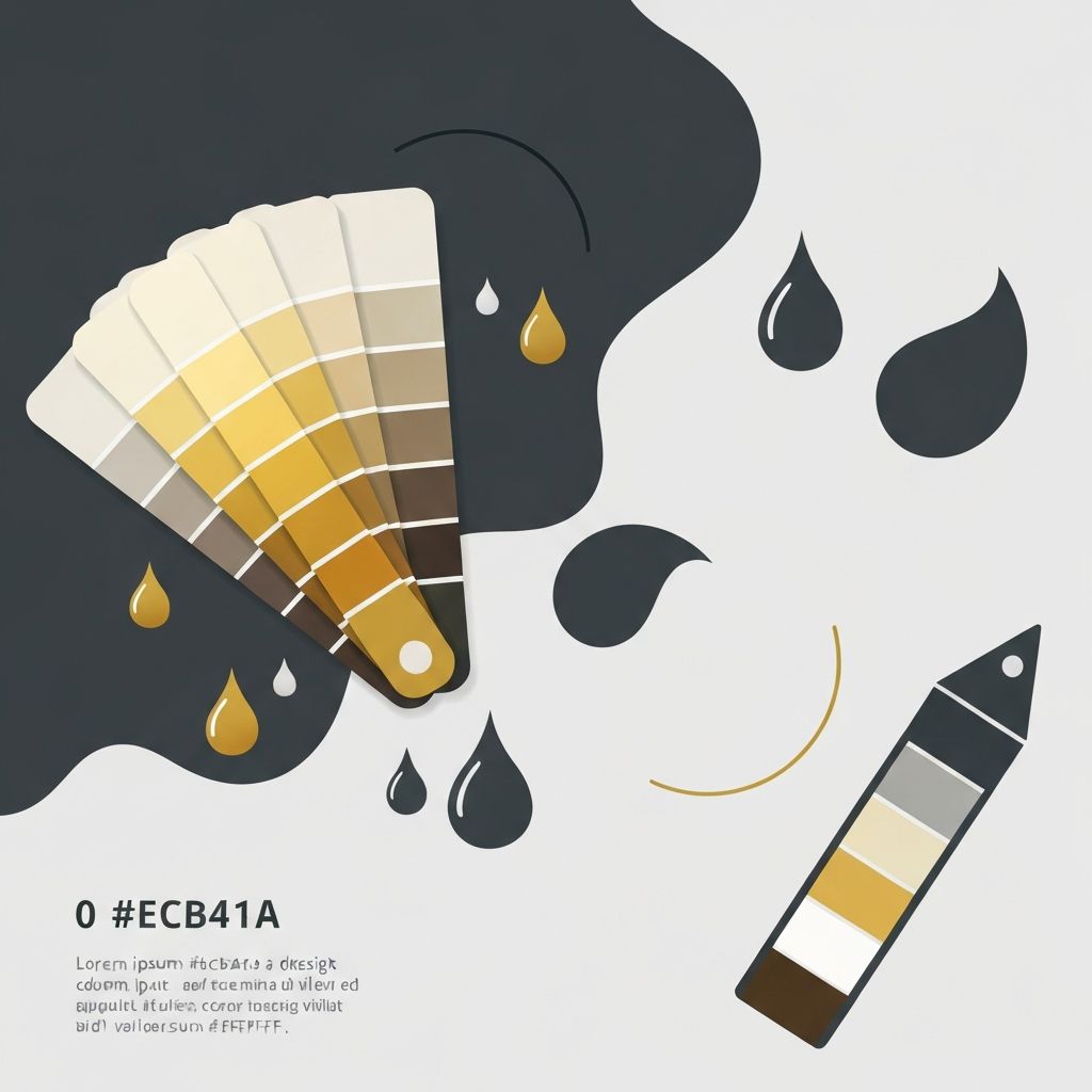
Color Psychology and Emotion
Different colors evoke different emotions, and these associations are deeply rooted in culture and biology. Blue communicates trust, stability, and professionalism, which is why so many banks and tech companies use it. Red conveys urgency, passion, and excitement, making it effective for sales and food brands. Green suggests nature, health, and prosperity, while yellow projects optimism and warmth.
Understanding these associations helps you choose colors that reinforce your brand message. A wellness brand using harsh, aggressive colors will feel off, while a finance company using playful pastels may struggle to be taken seriously.
Building a Cohesive Color Palette
A strong color palette typically includes one primary color, one or two secondary colors, an accent color, and a set of neutrals. The primary color represents your brand, secondary colors complement it, and the accent color is reserved for key calls to action and important highlights. Neutrals provide balance and create breathing room.
Tools like Adobe Color, Coolors, and Khroma help designers explore palettes based on color theory principles like complementary, analogous, triadic, and monochromatic schemes. Whichever you choose, consistency across your website is essential for a polished, professional feel.
Accessibility and Color Contrast
Color choices must consider accessibility, especially for users with visual impairments or color blindness. The Web Content Accessibility Guidelines specify minimum contrast ratios between text and background to ensure readability. Designers should test every color combination using tools like WebAIM's contrast checker.
Avoid relying on color alone to communicate information. For example, if a form field shows an error, pair the red color with an icon and a clear text message so colorblind users can still understand what happened.
Color and Brand Identity
Color is one of the strongest pillars of brand identity. Iconic brands like Coca-Cola, Tiffany & Co., and Cadbury are instantly recognizable by their signature hues. Your website should reinforce your brand colors consistently across every page and element, building recognition over time.
Document your color palette in a brand style guide that specifies hex codes, RGB values, usage rules, and combinations. This ensures consistency as your brand grows and as different team members or vendors create new content.
Using Color to Guide Behavior
Color is a powerful tool for directing user attention and behavior. A bold accent color reserved for primary calls to action draws the eye and signals what to click. Subtle background colors organize content into clear sections without overwhelming the visitor. Hover states and active states use color to provide feedback and reinforce interactivity.
Use color sparingly for emphasis. If everything is highlighted, nothing stands out. Restraint is one of the most underrated skills in color design.
Cultural Considerations
Color associations vary across cultures, which matters for brands serving global audiences. White symbolizes purity in many Western cultures but mourning in some Eastern ones. Red is lucky in China and dangerous in many Western contexts. Always research how your colors will be perceived by the audiences you serve.
Trends Versus Timelessness
Color trends come and go, from bold gradients to muted earth tones to vibrant neons. While it is fine to incorporate trendy accents, your core palette should be built for longevity. Constantly chasing trends can dilute your brand and confuse loyal customers.
Final Thoughts
Color in web design is both an art and a science. By understanding color psychology, building cohesive palettes, prioritizing accessibility, and aligning every choice with your brand, you can create websites that not only look beautiful but also drive measurable results. Color is too important to leave to chance.
Want to publish a guest post on aamconsultants.org?
Place an order for a guest post or link insertion today.