The Rise of Flat Web Design
Flat web design transformed the look of the internet starting in the early 2010s. After years of glossy buttons, drop shadows, gradients, and skeuomorphic interfaces that mimicked real-world objects, designers began stripping away ornamentation in favor of clean shapes, bold colors, and crisp typography. Apple's shift in iOS 7 and Microsoft's Metro design language pushed flat design into the mainstream, and the web followed quickly.
More than a decade later, flat design—and its evolution into "flat 2.0" or modern minimalist design—remains one of the most influential aesthetics on the internet. Understanding its principles helps designers and business owners build sites that feel modern, fast, and timeless.
Hire AAMAX.CO for Modern Flat Web Design
If you want a clean, modern flat design website built on solid technical foundations, you can hire AAMAX.CO, a full-service digital marketing company offering web development, digital marketing, and SEO services worldwide. Their team designs minimalist, conversion-focused websites that combine the best of flat design with modern usability standards. Their website design services produce fast-loading, accessible, and beautifully simple sites that perform exceptionally well across every device.
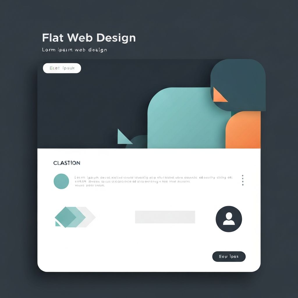
Core Principles of Flat Design
Flat design is built on a few clear principles. First, it removes unnecessary visual effects like heavy shadows, gradients, and textures. Second, it relies on bold, solid colors to create hierarchy. Third, it embraces simple geometric shapes and clean iconography. Fourth, it prioritizes typography as a primary design element. Finally, it focuses heavily on whitespace, allowing content to breathe.
Why Flat Design Took Over
Flat design rose to dominance for several practical reasons. Mobile devices needed lightweight visuals that loaded quickly and rendered crisply on high-resolution screens. Designers needed scalable systems that worked across phones, tablets, and desktops. Users wanted faster, less cluttered interfaces. Flat design solved all these problems while looking refreshingly modern.
The Strengths of Flat Design
Flat design produces fast websites because it relies on simple shapes, vector icons, and minimal images. It scales beautifully across screen sizes and resolutions. It encourages clear hierarchy and obvious calls to action. It ages gracefully because it avoids trendy textures or skeuomorphic gimmicks. And it is friendly to accessibility, since high contrast and clear typography are core principles.
The Weaknesses Designers Discovered
Pure flat design also revealed real weaknesses. Buttons sometimes looked indistinguishable from non-clickable elements, hurting usability. Lack of depth made it harder to guide users through complex interfaces. Some flat sites felt sterile or generic, especially when designers relied on the same color palettes and icon styles. These issues led to the emergence of "flat 2.0."
The Evolution: Flat 2.0 and Modern Minimalism
Flat 2.0 brought back subtle depth without abandoning flat design's clarity. Soft shadows, gentle gradients, layered cards, and subtle animations restored visual hierarchy and tactile feel. Today's minimalist web design—often seen on SaaS sites, product pages, and modern brand websites—blends flat design's clean aesthetic with thoughtful depth, micro-interactions, and rich typography.
Color in Flat Web Design
Color is the workhorse of flat design. Bold, saturated palettes communicate energy; muted earth tones convey calm and sophistication; monochrome schemes produce timeless elegance. Choose a primary brand color, two or three supporting tones, and one strong accent color for calls to action. Maintain strong contrast for readability and accessibility.
Typography as a Hero
Without heavy textures and effects, typography carries enormous weight in flat design. Pair a strong display typeface for headlines with a highly readable sans-serif body font. Use generous line height, clear sizing hierarchy, and consistent spacing. Modern variable fonts offer additional flexibility for performance and design.
Iconography and Illustrations
Flat icons and custom illustrations are signature elements of flat design. Custom illustrations help websites stand out from generic stock photography. Vector-based SVG icons load quickly, scale infinitely, and can be styled with CSS. Consistent icon families create cohesion across the site.
Performance and SEO Benefits
Flat design naturally aligns with modern performance and SEO best practices. Smaller image sizes, fewer heavy effects, and clean code produce fast load times and strong Core Web Vitals scores. Search engines reward speed, mobile usability, and clear structure, all of which flat design delivers.
Common Mistakes to Avoid
Avoid making interactive elements look identical to static ones. Always provide visual cues such as subtle shadows, hover states, or color changes. Do not over-rely on flat illustrations to the point that they feel generic. Test designs with real users to ensure clarity and usability.
Final Thoughts
Flat web design redefined what modern websites look like. Its evolution into flat 2.0 and broader minimalism continues to dominate the web in 2026, blending clean aesthetics with thoughtful depth and motion. Whether you are launching a new brand or refreshing an existing site, embracing flat design principles will help you build something timeless, fast, and delightful to use.
Want to publish a guest post on aamconsultants.org?
Place an order for a guest post or link insertion today.