The Rise of Gradient Web Design
Gradients have made a powerful comeback in the world of web design. Once considered outdated relics of early 2000s skeuomorphism, gradients now play a central role in modern, vibrant interfaces used by leading brands like Stripe, Apple, Spotify, and Instagram. The new wave of gradient web design embraces bold color transitions, soft pastel blends, and even subtle mesh gradients that add depth without distraction.
This visual trend reflects a broader shift toward emotional, expressive design. Flat design provided clarity and simplicity, but gradients reintroduce dimension, energy, and personality—qualities that help websites stand out in a crowded digital landscape.
Bring Your Vision to Life with AAMAX.CO
If you want to incorporate stunning gradient designs into your website without compromising performance or usability, AAMAX.CO can help. They are a full-service digital marketing company offering website design, development, and SEO services worldwide. Their team understands how to balance creative aesthetics with conversion-focused strategy, ensuring your gradient-driven design also drives measurable business results.
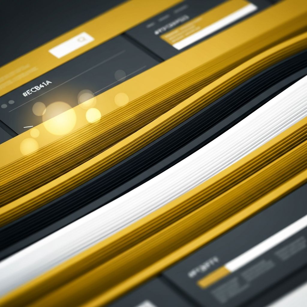
Types of Gradients in Modern Web Design
Modern gradient web design includes several styles. Linear gradients transition colors in a straight line and are commonly used for backgrounds, buttons, and headers. Radial gradients spread colors outward from a central point, creating glow effects ideal for hero sections. Conic gradients rotate colors around a center point and are increasingly popular for badges, charts, and decorative elements.
Mesh gradients—blurred blends of multiple colors—have surged in popularity thanks to tools like Figma and CSS advancements. They create soft, atmospheric backgrounds that feel both futuristic and organic. Duotone gradients use only two colors and are favored for photography overlays, while monochrome gradients shift between shades of a single color for elegant, minimalist looks.
Why Gradients Work So Well
Gradients add visual interest and hierarchy without adding clutter. They guide the user’s eye toward important elements like calls to action, headlines, or product highlights. They also reinforce branding by creating signature color combinations that become instantly recognizable—think of Instagram’s sunset palette or Stripe’s vibrant purple-to-blue blends.
From a psychological perspective, gradients evoke movement, energy, and emotion. A warm gradient feels inviting, while a cool gradient feels calm and trustworthy. Designers can tap into these subconscious cues to align visual design with brand values.
Best Practices for Using Gradients
While gradients can elevate a design, misusing them can make a site feel chaotic or amateurish. Stick to a coherent color palette aligned with your brand. Use gradients purposefully—on hero sections, CTAs, illustrations, or accent elements—rather than splattering them across every component.
Maintain accessibility by ensuring sufficient contrast between text and gradient backgrounds. Tools like the WebAIM Contrast Checker can help verify readability. Avoid placing fine text directly on busy gradients; instead, use overlays or solid color blocks to ensure clarity.
Performance Considerations
Modern CSS makes implementing gradients lightweight and efficient. Native CSS gradients render quickly and scale beautifully across screen sizes without increasing page weight. However, complex mesh gradients are often exported as images or SVGs, which can affect performance if not optimized. Compress and lazy-load these assets to maintain fast page loads.
For animation, use CSS transitions or transforms rather than animating gradient stops directly, which can be CPU-intensive. WebGL or Canvas can deliver more advanced gradient animations but require careful implementation by experienced developers.
Pairing Gradients with Typography and Imagery
Typography choices can make or break gradient web design. Bold, modern sans-serif fonts pair well with vibrant gradients, while elegant serifs complement softer pastel blends. Maintain a clear visual hierarchy with consistent type scaling and ample whitespace.
When combining gradients with imagery, choose photos with simple compositions and color palettes that complement the gradient. Duotone treatments—where a photo is tinted with two gradient colors—create a unified look that reinforces brand identity. Subtle grain or noise overlays can also add texture and prevent gradients from looking too digital.
Examples of Successful Gradient Designs
Stripe’s homepage is a masterclass in gradient web design, using a fluid, animated mesh gradient as a hero background. Apple uses gradient overlays on product photography to add depth and drama. Spotify’s playlists use dynamic gradients generated from album artwork, creating personalized visual experiences for every user.
Smaller brands and startups also benefit from gradients to differentiate themselves. A bold gradient hero, paired with clean typography and clear calls to action, can make a startup feel more established and innovative.
Final Thoughts
Gradient web design is more than a passing trend—it is a versatile visual tool that, when used thoughtfully, brings websites to life. By choosing the right type of gradient, aligning colors with your brand, and prioritizing accessibility and performance, you can create memorable, modern designs that resonate with users.
If you are ready to refresh your website with bold, gradient-driven design, partnering with experienced professionals will help ensure the result is not just beautiful but also high-performing, accessible, and aligned with your business goals.
Want to publish a guest post on aamconsultants.org?
Place an order for a guest post or link insertion today.