The Rise of Maximalist Web Design
For more than a decade, minimalism dominated the web. Clean grids, abundant whitespace, and restrained typography became the default look. In recent years, however, maximalist web design has surged in popularity. Bold colors, expressive typography, layered illustrations, and unexpected interactions are challenging the idea that less is always more.
This article explores what maximalist web design really is, when it works, and how to use it without overwhelming your visitors.
Hire AAMAX.CO to Craft Bold, Memorable Websites
If you want a website that stands out instead of blending in, AAMAX.CO offers expert design and development services worldwide for brands that are not afraid to be different. Their team has experience guiding bold creative directions while keeping performance, accessibility, and conversion in mind. They specialize in distinctive website design that captures a brand's personality without sacrificing usability.
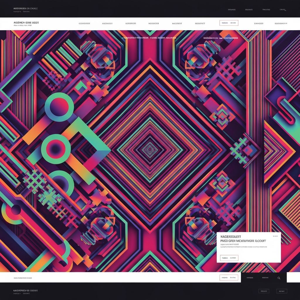
What Defines Maximalist Web Design
Maximalism is more than just "more stuff." At its core, it is an expressive design philosophy that embraces complexity, personality, and rich storytelling. Common traits include bold and even clashing colors, oversized typography, layered illustrations, scrapbook-like collages, generous animations, and unexpected scrolling experiences.
Despite the visual intensity, the best maximalist sites are still carefully composed. Every layer, color, and animation has a reason to exist. Without that intent, maximalism quickly becomes chaos.
When Maximalist Design Makes Sense
Maximalism works particularly well for brands with strong personalities, including creative agencies, fashion labels, music artists, lifestyle brands, and indie products. It is also a good fit for portfolio sites where standing out is part of the value proposition.
However, maximalism is not always appropriate. For example, financial services, healthcare providers, and enterprise software typically benefit from more restrained design that emphasizes trust and clarity. Always start with the audience and the message, not the trend.
Color and Typography in Maximalist Design
Color in maximalist design is often vivid and unconventional. Designers may pair colors that traditional rules would discourage, intentionally creating tension and energy. The key is to ensure that there is still enough contrast for readability and accessibility.
Typography becomes a design element in its own right. Oversized headlines, mixed typefaces, custom lettering, and unusual layouts add character. To keep things legible, body text usually remains relatively conservative even when display text is dramatic.
Layout, Layers, and Composition
Maximalist layouts often abandon strict grids in favor of layered, magazine-style compositions. Elements overlap, rotate, and break the edges of containers. This creates depth and movement, but also requires careful attention to focus. Without clear focal points, visitors do not know where to look.
Designers should plan compositions that lead the eye intentionally, using size, color, and position to direct attention even within busy scenes.
Animation and Interaction
Maximalism on the web frequently embraces animation. Hover effects, scroll-triggered transitions, particle effects, and playful micro-interactions all add to the experience. When done well, these interactions reinforce the brand's personality and reward exploration.
The risk is overdoing it. Too much motion can be distracting, slow, or even nauseating for some users. Always provide options to reduce motion for those who need it, and test performance on a range of devices.
Performance and Accessibility Concerns
Maximalist sites can be heavy. Large images, custom fonts, and rich animations all add to load times. Designers and developers should optimize aggressively, using compressed images, lazy loading, and efficient code. The visual richness should not come at the cost of basic usability or speed.
Accessibility deserves special attention. Color contrast, focus states, and keyboard navigation must all be carefully tested. A bold visual style is no excuse for excluding part of your audience.
Pitfalls to Avoid
The biggest pitfall in maximalist design is mistaking quantity for quality. Adding more colors, fonts, and animations does not automatically create a better experience. Each addition should serve the brand and the user.
Another common mistake is ignoring the basics, such as clear navigation, readable text, and obvious calls to action. No matter how expressive your design, users still need to be able to do what they came to do.
Final Thoughts
Maximalist web design can be incredibly powerful when it is done with intention. By combining bold creativity with careful planning, performance optimization, and accessibility, you can create sites that are both expressive and effective. For ambitious projects that mix bold visuals with complex functionality, partnering with experts in website development ensures that the technical execution lives up to the creative vision.
Want to publish a guest post on aamconsultants.org?
Place an order for a guest post or link insertion today.