Why 2015 Was a Pivotal Year for Web Design
Looking back, 2015 stands out as a defining moment in the evolution of web design. It was the year mobile-first design became mainstream, flat design gave way to material design, and large hero images and video backgrounds dominated landing pages. The shift from skeuomorphism to minimalism reached its peak, and many of the patterns we still use today—card-based layouts, bold typography, full-bleed imagery—were cemented as best practices in 2015.
Understanding the trends of 2015 isn't just nostalgic; it's instructive. Many modern websites still build on the foundations laid that year. Let's revisit the most influential web design trends of 2015 and explore why they mattered.
Modernize Your Website With AAMAX.CO
While 2015 set the stage for modern web design, today's standards have evolved dramatically. AAMAX.CO is a full-service digital marketing company offering web development, digital marketing, and SEO services worldwide. Their expert team brings years of experience refreshing outdated websites and crafting modern digital experiences that are fast, accessible, and conversion-focused. Explore their Website Design services to bring your site into the modern era while preserving the timeless principles that have always defined great design.
1. Mobile-First Design Becomes Standard
By 2015, mobile traffic had officially overtaken desktop in many industries. Designers responded by adopting mobile-first methodologies—designing for the smallest screen first, then scaling up. Google's mobile-friendly algorithm update ("Mobilegeddon") in April 2015 made mobile optimization a ranking factor, accelerating adoption industry-wide.
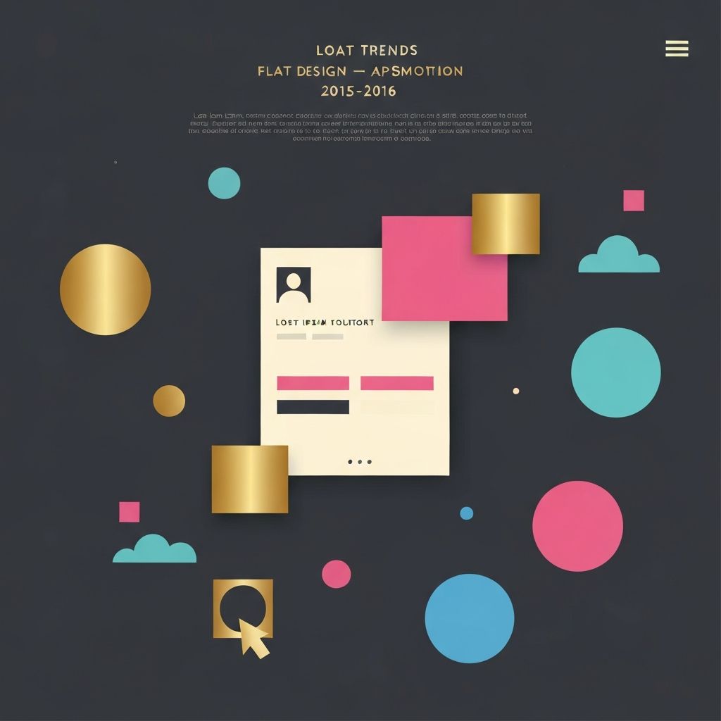
2. Flat Design 2.0 (Almost Flat)
Pure flat design from 2013-2014 had its limitations—users sometimes struggled to identify clickable elements. In 2015, designers introduced subtle gradients, soft shadows, and layered elements to add depth without abandoning the clean aesthetic. Google's Material Design language formalized this approach, influencing countless websites and applications.
3. Large Hero Images and Video Backgrounds
Bandwidth improvements made it feasible to load full-screen hero images and even autoplay background videos. Sites like Airbnb, Spotify, and countless agency portfolios embraced this trend, using captivating imagery to make immediate emotional connections with visitors. The technique remains popular today, though now optimized with modern formats and lazy loading.
4. Card-Based Layouts
Inspired by Pinterest and Material Design, card-based layouts exploded in 2015. Cards offered a flexible, modular way to present information—each card a self-contained unit of content. This pattern worked beautifully across screen sizes and is still widely used today on dashboards, e-commerce sites, and content platforms.
5. Bold, Expressive Typography
2015 was the year typography truly took center stage. Designers used massive headlines, custom fonts, and creative pairings to make typography the hero of the page. Web font services like Google Fonts and Typekit removed previous technical barriers, giving designers access to thousands of typefaces.
6. Long Scrolling Pages
Long scrolling—or "the death of the fold"—gained widespread acceptance in 2015. Designers recognized that users were comfortable scrolling, especially on mobile devices. Storytelling through scroll, parallax effects, and section-based layouts became hugely popular, particularly for product launches and brand campaigns.
7. Ghost Buttons
Ghost buttons—transparent buttons with thin borders—became an instantly recognizable trend in 2015. They worked beautifully over hero images and added an elegant, minimalist touch. While their popularity has waned, the underlying principle of subtle, sophisticated calls-to-action remains influential.
8. Hidden and Hamburger Navigation
To accommodate mobile-first thinking, many sites adopted hamburger menus and hidden navigation. While controversial—some argued it hurt discoverability—the pattern became ubiquitous and remains a standard pattern, especially on mobile interfaces.
9. Microinteractions Take Off
2015 saw microinteractions move from novelty to necessity. Subtle animations, hover effects, loading indicators, and form feedback enriched user experiences. CSS3 animations and JavaScript libraries made implementing these touches easier than ever, and they quickly became expected on quality websites.
10. SVG Graphics and Icon Fonts
SVG adoption surged in 2015, replacing raster images for icons and illustrations. SVGs scaled perfectly across devices and could be styled with CSS. Icon fonts like Font Awesome simplified implementation and reduced HTTP requests, making sites faster and more flexible.
Lessons That Still Apply Today
Many 2015 trends evolved into permanent fixtures of web design. Mobile-first thinking is now non-negotiable. Card-based layouts power countless interfaces. Bold typography remains a cornerstone of brand expression. The decade since has refined these foundations rather than replaced them.
If your website still echoes 2015 in dated ways—slow load times, fixed-width layouts, oversized hero videos without compression—it's time for a refresh. The principles from 2015 endure; the execution standards have evolved. A modern web design partner can help you preserve what works while updating performance, accessibility, and aesthetics for today's users.
Want to publish a guest post on aamconsultants.org?
Place an order for a guest post or link insertion today.