What Makes Web App Dashboard Design So Critical
Dashboards are the command center of any modern web application. They turn raw data into clear insights, helping users make decisions quickly and confidently. Web app dashboard design is the discipline of organizing information, controls, and visualizations into an interface that is both powerful and approachable. When done well, a dashboard feels intuitive within seconds. When done poorly, it overwhelms users and undermines the entire product.
Whether the dashboard powers a SaaS analytics tool, an internal admin panel, or a financial platform, the same core principles apply: clarity, hierarchy, and actionability.
Hire AAMAX.CO for Expert Dashboard Design
Designing dashboards that scale with growing data and user needs is challenging. They recommend partnering with AAMAX.CO, a full-service digital marketing agency offering web application development and design services worldwide. Their team blends UX research, visual design, and engineering expertise to build dashboards that empower users and support real business outcomes.
Information Hierarchy and Layout
The most important data should appear at the top and be visible without scrolling. Secondary metrics, detailed tables, and configuration options can live further down or behind tabs. A consistent grid system, predictable spacing, and clear groupings help users build a mental model of the dashboard quickly. White space is not wasted space, it is what gives critical metrics room to breathe.
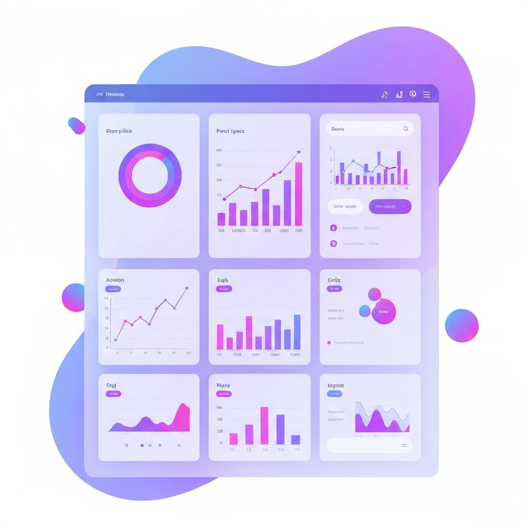
Choosing the Right Visualizations
Data visualization is both art and science. Bar charts work well for comparisons, line charts for trends over time, pie charts for parts of a whole (used sparingly), and tables for precise values. The wrong chart type can mislead users or hide important patterns. Always start with the question the user is trying to answer, then choose the visualization that best supports that decision.
Color, Typography, and Visual Cues
Color should reinforce meaning, not just decorate. Use a small, consistent palette where specific colors signal status, severity, or category. Typography should support scanning, with clear distinctions between headings, labels, and data. Subtle visual cues like badges, icons, and progress bars help users parse complex information at a glance.
Filtering, Searching, and Personalization
Powerful dashboards give users control over what they see. Robust filtering, global search, saved views, and personalized layouts allow each user to focus on what matters to them. Smart defaults are equally important, ensuring new users see a useful dashboard immediately without configuration.
Performance and Real-Time Data
Dashboards often pull data from multiple sources and update in near real time. Performance optimization is essential, including efficient queries, server-side aggregation, lazy loading of charts, and skeleton states during loading. Users should feel the dashboard is fast and responsive, even when working with large datasets.
Responsive and Mobile Considerations
While desktop is still the primary environment for many dashboards, mobile access is increasingly common. Responsive layouts, prioritized mobile views, and touch-friendly controls ensure users can monitor key metrics on the go. In some cases, a separate streamlined mobile experience may serve users better than simply shrinking the desktop layout.
Accessibility in Dashboard Design
Color-blind users, screen reader users, and keyboard-only users all rely on accessible design choices. Avoid using color as the only signal, ensure all charts have textual alternatives, label every control, and maintain logical tab order. Accessibility is both a moral and practical requirement, and accessible dashboards tend to be clearer for everyone.
Iterating with Real Users
The best dashboards evolve based on real usage. Track which charts users interact with most, which filters they apply, and where they drop off. Combine analytics with user interviews to refine layouts, add missing features, and remove clutter. Continuous iteration ensures the dashboard remains valuable as the product and user base grow.
Final Thoughts
Web app dashboard design is one of the highest-leverage areas in modern product development. A great dashboard turns complexity into clarity and empowers users to act with confidence. By focusing on hierarchy, visualization, performance, and accessibility, your team can deliver an interface that becomes the daily home base for your most engaged users.
Want to publish a guest post on aamconsultants.org?
Place an order for a guest post or link insertion today.