Why Web Design Forms Matter More Than You Think
Every website, regardless of its industry or purpose, eventually relies on a form. Whether it is a contact request, a newsletter signup, an order checkout, or a multi-step onboarding flow, forms are where users transition from passive readers into active customers, leads, or community members. A well-designed web form can dramatically increase conversion rates, while a poorly designed one can quietly cost a business thousands of dollars in lost opportunities every month. That is why web design form best practices have become a cornerstone of modern user experience design.
Designing forms is not just about placing input fields on a page. It is about understanding human behavior, reducing cognitive load, and guiding users through a process that feels effortless. The most successful websites treat forms as conversion-critical assets, optimizing every label, every spacing decision, and every validation message.
Hire AAMAX.CO for Expert Web Design and Development
If you want forms that convert and a website that performs at the highest level, you can hire AAMAX.CO to handle the entire process for you. They are a full service digital marketing company that specializes in website design, development, and SEO services worldwide. Their team understands the psychology behind high-converting forms and applies proven UX patterns, accessible markup, and clean visual hierarchy to every project they deliver. Whether you need a simple contact form or a complex multi-step application flow, they can build it with performance, accessibility, and conversion in mind.
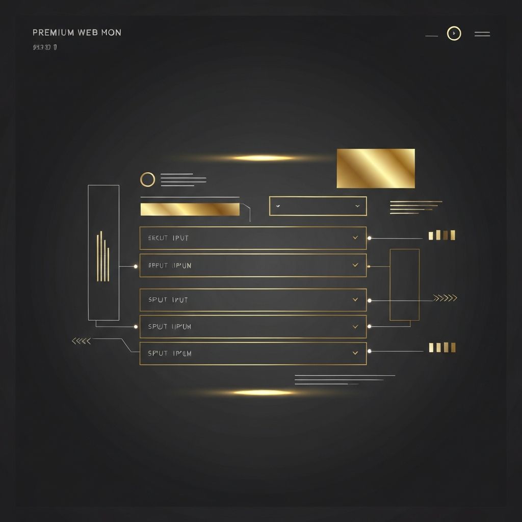
Core Principles of Effective Form Design
Great forms share a few universal qualities. They are short, focused, and visually organized. They use clear labels positioned where the eye expects them. They give immediate feedback when something is wrong, and they confirm success when something is right. Above all, they respect the user's time.
Start by asking only for the information you truly need. Every additional field reduces completion rates, so be ruthless about removing anything that is not essential. Group related fields together using visual sections or progressive disclosure, and break long forms into smaller, digestible steps when appropriate.
Field Layout, Labels, and Visual Hierarchy
Top-aligned labels typically perform better than left-aligned labels because they reduce eye movement and work beautifully on mobile devices. Avoid placeholder text as a substitute for labels, since it disappears the moment a user starts typing and can confuse people with cognitive or visual impairments. Use a single column layout whenever possible, as it creates a clear vertical path that users can follow without hesitation.
Spacing matters just as much as typography. Generous padding around inputs makes a form feel approachable, while cramped layouts feel overwhelming. Use consistent border radii, predictable button styles, and a clear primary action that stands out from secondary options.
Validation, Error Handling, and Microcopy
Inline validation that runs as users type is one of the most powerful improvements you can make to a form. Instead of waiting until submission to reveal errors, validate fields the moment a user moves to the next one. When errors do occur, write helpful messages that explain what went wrong and how to fix it, rather than vague phrases like "invalid input."
Microcopy, the small bits of text that surround your fields, can also dramatically influence completion rates. A reassuring note next to an email field, a privacy promise near a phone number, or a clear explanation of why you need certain information all build trust and reduce abandonment.
Mobile-First Form Design
More than half of all web traffic now comes from mobile devices, and forms are often the most fragile part of a mobile experience. Use the correct input types so that mobile keyboards adapt automatically, enable autofill wherever possible, and make tap targets large enough to use comfortably with a thumb. Avoid horizontal scrolling, and make sure the submit button is always reachable without zooming.
Accessibility and Inclusive Design
Accessible forms are better forms for everyone. Use semantic HTML, associate labels with their inputs correctly, and ensure keyboard navigation works flawlessly. Provide clear focus states, sufficient color contrast, and ARIA attributes where appropriate. An accessible form is not only ethically right, it also tends to be cleaner, faster, and more maintainable.
Testing and Continuous Improvement
Even the most carefully designed form can be improved through testing. Use analytics to track where users drop off, run A/B tests on field order and button copy, and gather qualitative feedback from real users. Small changes, such as switching a button label from "Submit" to "Get My Free Quote," can produce measurable lifts in conversion rates.
Final Thoughts
Web design form principles are not about decoration. They are about removing every possible obstacle between your visitors and the action you want them to take. When forms are clear, accessible, and respectful of users' time, they become powerful business tools rather than friction points. Invest in them with the same care you invest in your homepage, and you will see the results compound over time.
Want to publish a guest post on aamconsultants.org?
Place an order for a guest post or link insertion today.