The Critical Role of the Navigation Bar
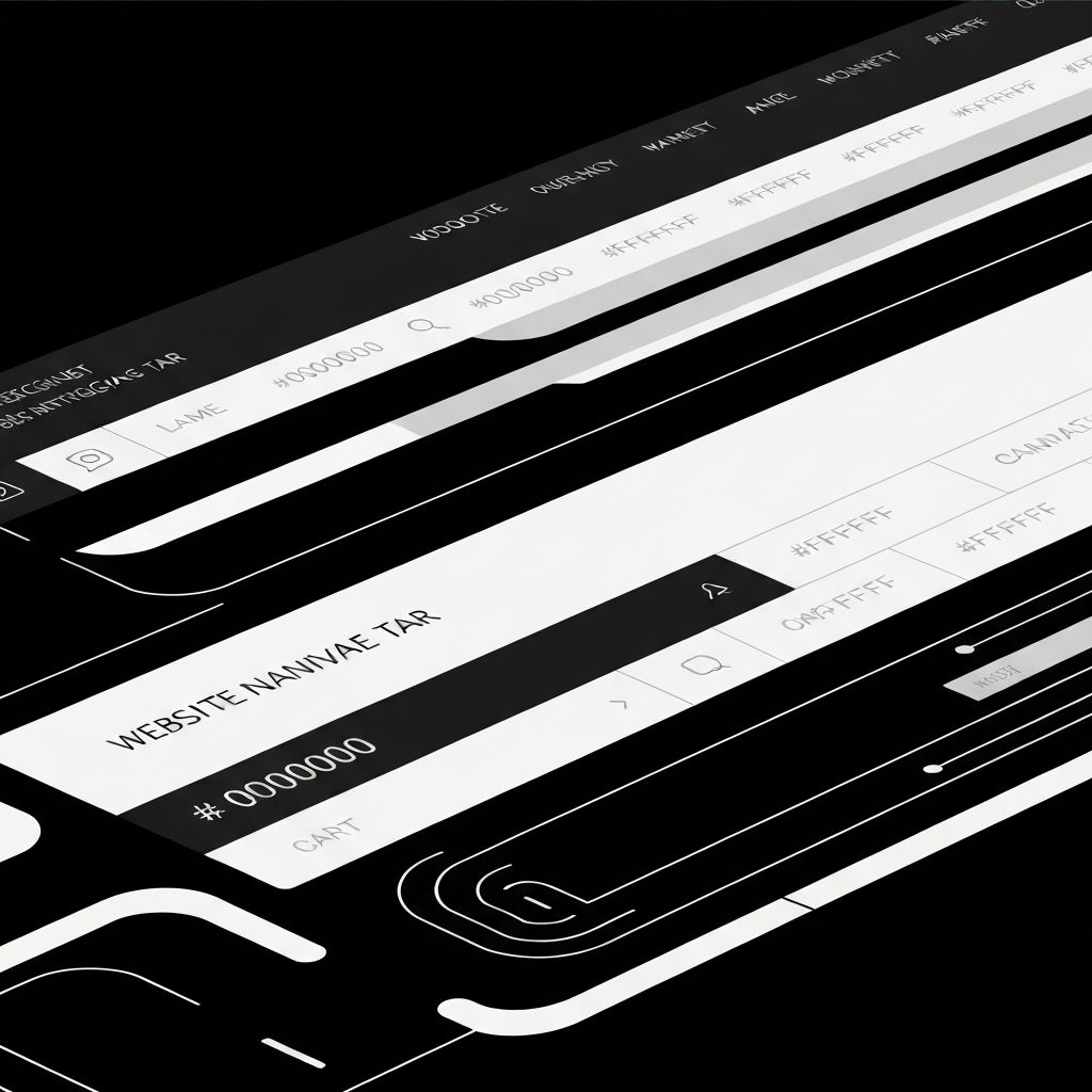
The navigation bar is one of the most important elements on any website. It is the map, the table of contents, and the primary wayfinding system all in one. Visitors rely on it to understand what your site offers, decide where to go next, and orient themselves throughout their journey. A confusing navigation bar drives users away within seconds, while a clear one quietly increases time on site, page depth, and conversion rates.
Despite its importance, navigation often gets squeezed into the final stretch of a project. Treating it as a strategic deliverable from the start pays huge dividends in usability and business performance.
Hire AAMAX.CO for Web Design and Development Services
If you want a navigation system engineered for clarity and conversion, consider working with AAMAX.CO. They are a full-service digital marketing company offering web development, digital marketing, and SEO services worldwide. Their web design experts approach navigation as a strategic discipline that influences every page, ensuring users always know where they are and where to go next.
Information Architecture Comes First
Great navigation begins with great information architecture. Before designing menus, group your content logically based on user goals, not internal departments. Card sorting exercises with real users reveal natural categories that may differ from what the team assumes. Tree testing then validates whether users can find specific pages quickly within your proposed structure.
Keep top-level categories to a manageable number, typically five to seven, and resist the temptation to surface every page at the top. Strong hierarchy beats crowded menus every time.
Designing for Clarity and Scannability
Use clear, descriptive labels that match the language your audience already uses. Avoid clever marketing terms that obscure meaning. Favor familiar patterns, such as logo on the left and primary actions on the right, because users have learned to expect them. Ensure adequate spacing between items so links are easy to click on touch devices.
Active states should clearly indicate the current section. Hover and focus styles must be visible for both mouse and keyboard users, supporting accessibility and confidence.
Responsive Navigation Patterns
On smaller screens, navigation must adapt without sacrificing access. The hamburger menu remains common, but more sites are experimenting with bottom navigation bars on mobile to mirror native app patterns and improve thumb reachability. Whichever pattern you choose, ensure that key actions like search, account, and primary CTAs remain visible without requiring an extra tap when possible.
Mega menus can be powerful for large sites but must be designed carefully. Group related items, use icons sparingly, and never let mega menus become walls of links that overwhelm users.
Sticky, Hidden, and Smart Navigation
Sticky navigation bars keep key actions accessible as users scroll, which is especially valuable on long pages. Smart navigation that hides on scroll-down and reappears on scroll-up offers a balance between usefulness and unobtrusive design. Both approaches must be implemented thoughtfully so they enhance rather than distract from the content.
Avoid making navigation too clever. Hidden patterns that surprise users typically hurt more than they help. When in doubt, choose predictability.
Accessibility in Navigation
Navigation must work flawlessly for keyboard, screen reader, and assistive technology users. Use proper landmarks, semantic HTML elements, and ARIA attributes only where they add clarity. Skip-to-content links help keyboard users bypass repetitive navigation. Color contrast, focus indicators, and resizable text ensure every visitor can navigate confidently.
Test with real assistive technologies, not just automated tools. Real-world testing surfaces issues that audits often miss.
Search, Personalization, and Conversion Triggers
For content-heavy or e-commerce sites, integrate a prominent search bar with autocomplete and intelligent suggestions. Personalized navigation, such as account links, recently viewed items, or location-aware menus, can significantly improve relevance. Place a clear primary CTA in the navigation, such as a sign-up, demo, or buy button, to keep conversion options always within reach.
Track navigation interactions in analytics. Click patterns reveal which paths users actually take and where the structure may need refinement.
Final Thoughts
The navigation bar is the silent ambassador of your website. Invest in research, hierarchy, clarity, and accessibility, and your visitors will reward you with deeper engagement and higher conversions. Treat it as a strategic asset, not an afterthought, and your entire site benefits.
Want to publish a guest post on aamconsultants.org?
Place an order for a guest post or link insertion today.