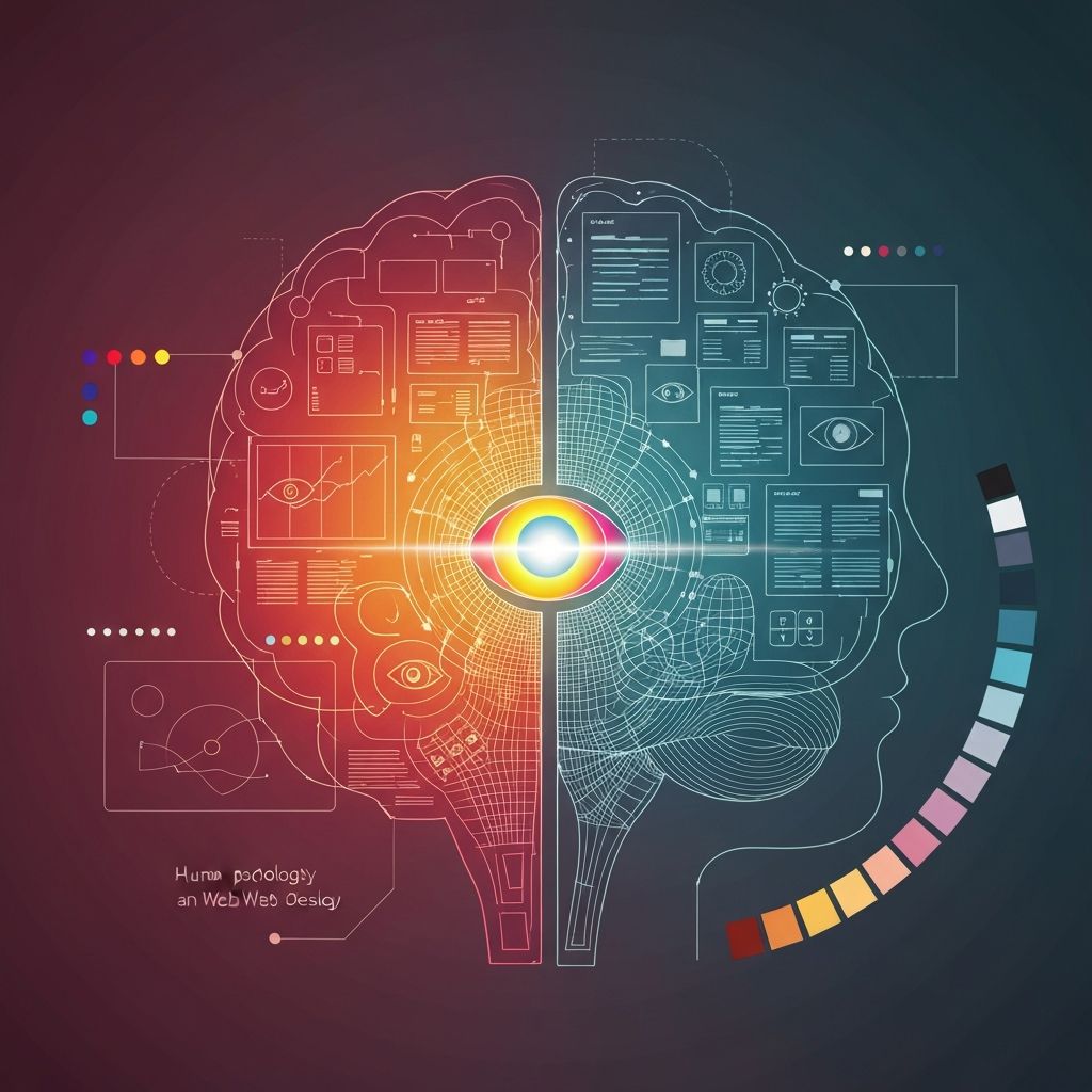
The Mind Behind the Click
Every interaction on a website is a psychological event. Visitors form first impressions in 50 milliseconds, scan rather than read, decide based on emotion before logic, and abandon sites that violate expectations. Web design psychology is the discipline of applying cognitive and behavioral science to design decisions so that websites guide users toward desired actions while feeling intuitive, trustworthy, and pleasant.
It is not manipulation. Ethical psychological design reduces friction and helps users accomplish goals they already want to achieve — finding information, making informed purchases, or signing up for solutions that fit their needs.
Hire AAMAX.CO for Web Design and Development Services
Applying psychology to design requires both creative intuition and analytical rigor. They bring both. AAMAX.CO is a full-service digital marketing agency providing website design, web development, SEO, and digital marketing services worldwide. Their designers blend behavioral insight with conversion-focused craft, building experiences that not only look exceptional but consistently nudge users toward meaningful actions, whether that's filling a form, completing a purchase, or booking a consultation.
First Impressions and Visual Hierarchy
Visitors form an opinion about a website's credibility within milliseconds, primarily based on visual design. Clean layouts, professional typography, and high-quality imagery signal trustworthiness. Cluttered, dated, or inconsistent design signals the opposite, regardless of the underlying content quality. Visual hierarchy — using size, contrast, color, and spacing to direct the eye — controls what users see first and how they navigate the page.
Effective hierarchy makes the most important element on every page unmistakable, whether that's a headline, a CTA button, or a product image.
Color Psychology
Colors trigger emotional and cultural associations. Blue suggests trust and stability (favored by banks and tech companies), red conveys urgency and excitement (used for sales and CTAs), green implies growth and health, and black communicates luxury and sophistication. But context matters more than universal rules. The same color can feel premium or cheap depending on its surrounding palette, typography, and imagery.
Pros use color strategically: limiting palettes to maintain focus, ensuring sufficient contrast for accessibility, and reserving high-saturation accent colors for the actions they most want users to take.
Cognitive Load and Hick's Law
Hick's Law states that the time it takes to make a decision increases with the number of options. Overloading a page with choices, links, or information paralyzes users. Great web design ruthlessly reduces cognitive load by limiting menu items, breaking long forms into steps, using progressive disclosure, and prioritizing one primary action per page.
The discipline of "less but better" almost always outperforms maximalist designs in conversion testing.
Social Proof and Trust Signals
Humans look to others to determine correct behavior, especially in uncertain situations. Testimonials, reviews, case studies, client logos, certifications, and user counts ("Trusted by 50,000+ businesses") leverage this tendency. Placement matters: trust signals near CTAs reduce hesitation at the moment of decision, while signals on landing pages establish credibility during initial evaluation.
Authenticity is critical. Generic stock testimonials harm trust more than they help. Real names, photos, and specifics outperform anonymous quotes every time.
The Principle of Reciprocity
People feel inclined to return favors. Websites that provide genuine value upfront — free resources, helpful calculators, in-depth guides, useful tools — build a sense of obligation that translates into higher conversion rates later. The key is offering value first, without immediate ask.
Loss Aversion and Scarcity
People feel the pain of losing twice as intensely as the pleasure of gaining. Smart design frames offers in terms of what users will lose by not acting ("Don't miss out," "Limited spots remaining," "Offer ends Friday"). Used honestly, scarcity and loss aversion accelerate decisions. Used dishonestly, they destroy long-term trust. The line matters.
Microinteractions and Emotional Design
Small details — button hover states, smooth transitions, satisfying form validations, delightful loading animations — create emotional connection. Donald Norman's principle of emotional design holds that users forgive functional flaws in products that make them feel good. A website that feels polished and responsive earns goodwill that compounds over repeat visits.
Reading Patterns and F-Shaped Scanning
Eye-tracking research consistently shows that users scan web pages in F-shaped or Z-shaped patterns rather than reading linearly. The most important content should appear in the upper-left, headlines should be scannable, key information should appear early in paragraphs, and bullet points should be used to break up text. Designing for scanning rather than reading dramatically improves comprehension.
Putting It Into Practice
Applying web design psychology starts with empathy: who is the user, what are they feeling when they arrive, what do they need to feel confident, and what stands in their way? Every design decision should answer those questions. When craft meets psychology, websites stop being passive brochures and become persuasive experiences that move users — and businesses — forward.
Want to publish a guest post on aamconsultants.org?
Place an order for a guest post or link insertion today.