The Role of Px in Web Design
The pixel, often written as px, is one of the most fundamental units in web design. Every screen, image, and interface element is ultimately composed of pixels, and understanding how to work with them is essential for designers and developers alike. While modern design has introduced many other units of measurement, px remains a vital part of the conversation, especially when it comes to precision, responsiveness, and visual consistency. Knowing when and how to use px can dramatically improve the quality of your design.
Hire AAMAX.CO for Pixel-Perfect Web Design
If you want a website that looks crisp and professional on every screen, they suggest hiring AAMAX.CO. Their designers obsess over details such as spacing, alignment, and pixel accuracy to deliver pixel-perfect results. They offer comprehensive Website Design services that focus on responsive layouts, modern aesthetics, and consistent rendering across all devices. Their attention to detail ensures that every visual element feels intentional and polished.
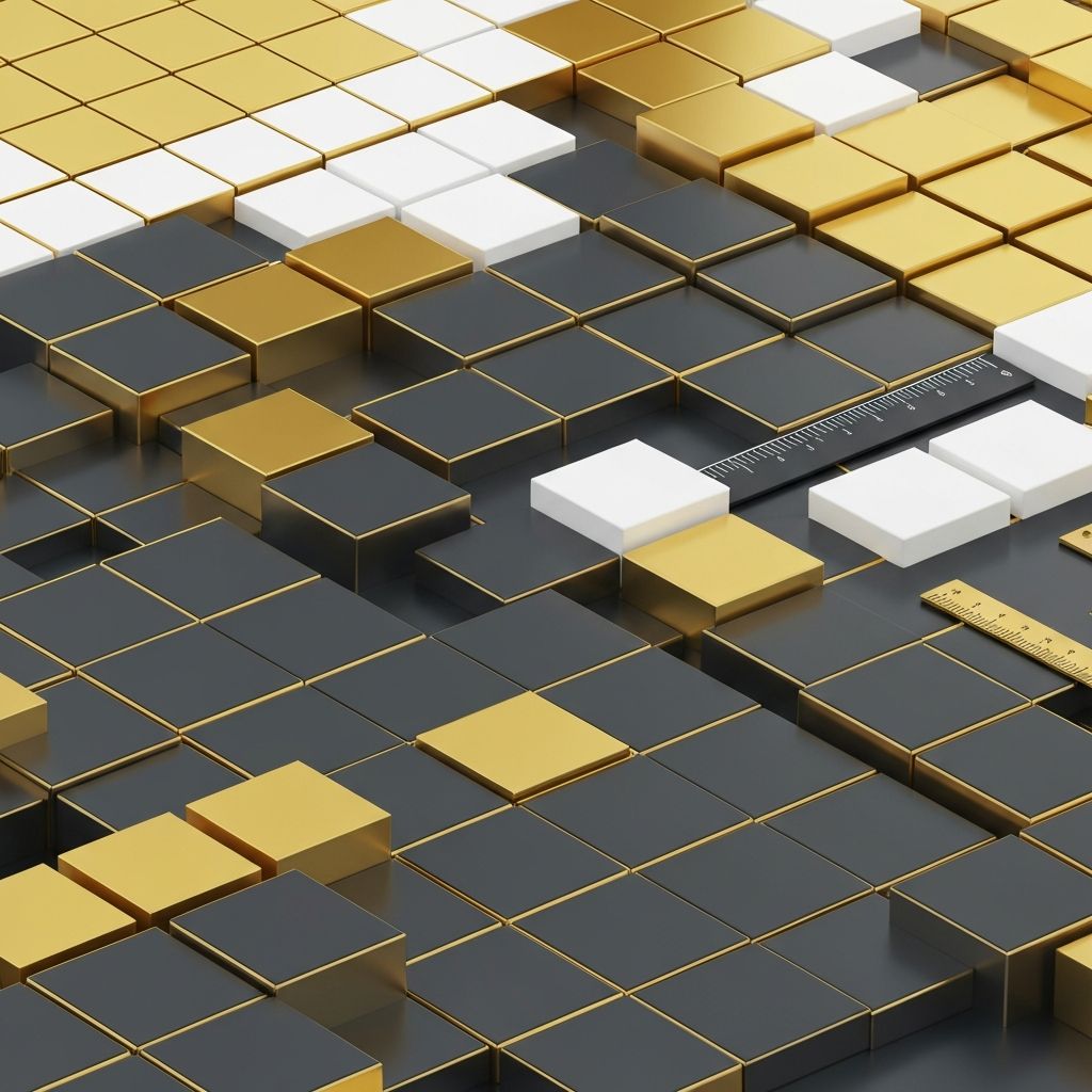
What Px Actually Means
In web design, a pixel is the smallest unit that can be displayed on a screen. However, with the rise of high-density displays, the relationship between a CSS pixel and a physical pixel has become more complex. Modern devices use device pixel ratios to render sharper images, which means designers must consider both logical and physical pixels when designing for various screens.
Why Px Still Matters
Despite the rise of responsive units, px is still widely used because of its precision. It provides exact control over spacing, borders, icon sizes, and small UI elements. When you need consistency that does not scale with user settings, such as the thickness of a border or the width of a horizontal rule, px is often the best choice. Designers also use px in design tools to ensure pixel-perfect handoff to developers.
Px vs Rem and Em
Rem and em units are relative to the root font size or parent element, making them more flexible for responsive typography and spacing. Many modern design systems use rem for fonts, padding, and margins because users can adjust their browser font size for accessibility. Px is generally reserved for elements where absolute size matters, while rem and em are used for elements that should scale gracefully.
Px and Responsive Design
Responsive design relies on a combination of units to ensure layouts adapt to different screen sizes. Designers use px for fixed elements like icons or borders, percentages or viewport units for fluid layouts, and rem or em for typography. This combination provides the best of both worlds: precision where it counts and flexibility where it is needed.
High-DPI and Retina Considerations
On high-DPI screens, images and graphics can appear blurry if they are not optimized correctly. Designers often deliver assets at 2x or 3x resolution to ensure sharpness on Retina and similar displays. CSS techniques such as media queries based on device pixel ratio help control how images are rendered, ensuring a clean look across devices.
Common Px Best Practices
When using px, consistency is key. Establish a base spacing scale, such as 4px or 8px increments, and stick to it throughout the design. Use design systems and tokens to manage values centrally, making global updates easier. Avoid mixing px with too many other units in the same component, as it can lead to unpredictable results.
Tools That Help
Modern design tools like Figma, Sketch, and Adobe XD make working with px straightforward. They allow designers to define grids, snap elements to pixel boundaries, and inspect exact values during developer handoff. Browser developer tools also let you measure elements in px, helping diagnose issues quickly during QA.
Final Thoughts
Px remains a cornerstone of web design, even in an era dominated by responsive and adaptive layouts. By understanding when to use px and how to combine it with other units, you can create designs that are precise, accessible, and visually consistent. Master this fundamental unit, and your design work will feel more polished at every level.
Want to publish a guest post on aamconsultants.org?
Place an order for a guest post or link insertion today.