Understanding Responsive Web Design
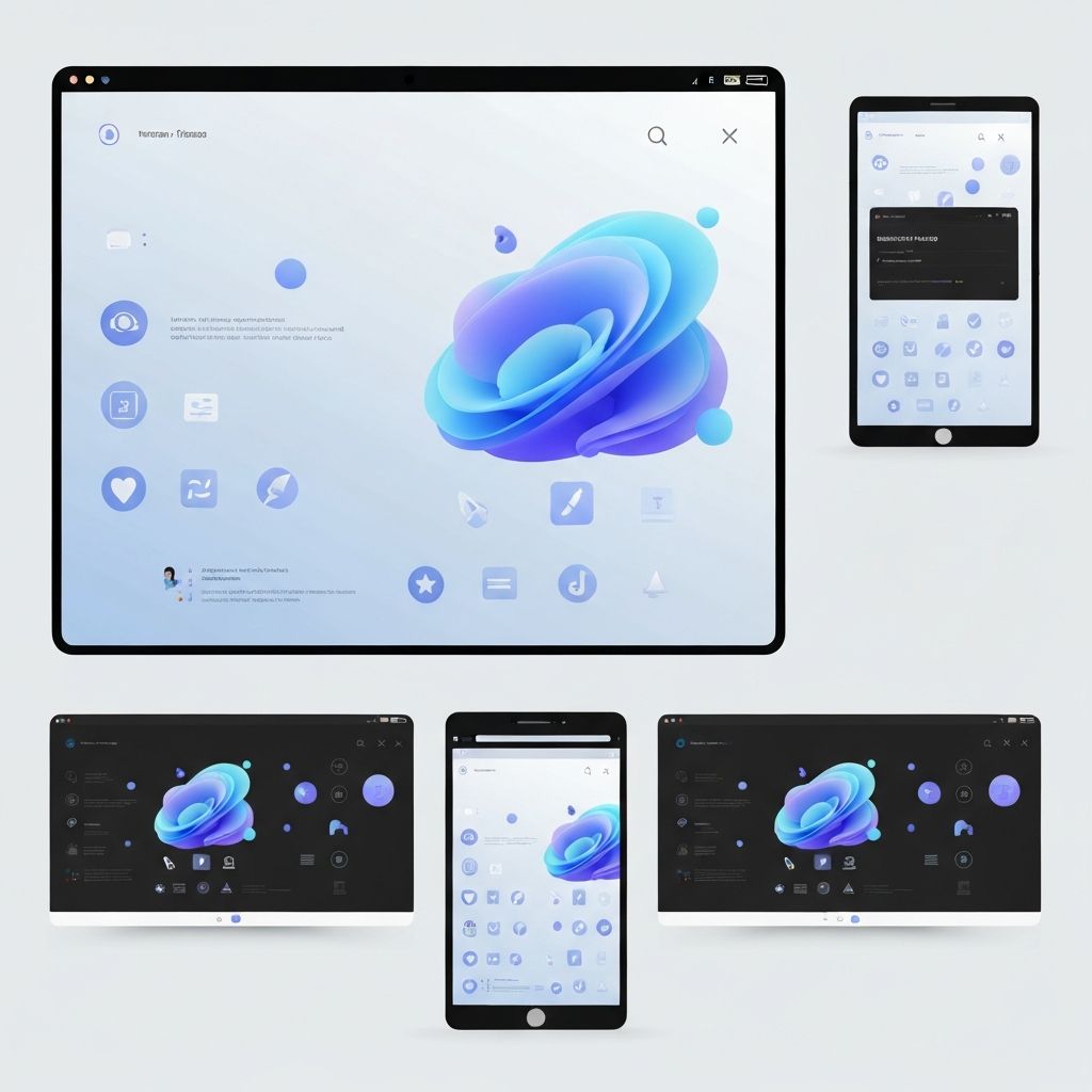
Responsive web design is the practice of building websites that automatically adapt to the screen size, orientation, and capabilities of any device. Whether a visitor arrives via a 27-inch desktop monitor, a tablet, or a small smartphone, the layout, typography, and imagery should reflow gracefully to deliver an optimal experience. This approach replaces the outdated practice of building separate mobile sites and is now the universal standard for modern web development.
The need for responsive design has only intensified. Mobile traffic accounts for the majority of web visits globally, and Google's mobile-first indexing means that the mobile version of a site is the primary version search engines evaluate. A non-responsive site is therefore invisible to a huge swathe of potential customers and search traffic.
Build Responsive Sites with AAMAX.CO
Businesses seeking pixel-perfect responsive websites can rely on AAMAX.CO for expert website development services. Their team builds fully fluid, mobile-first sites that perform exceptionally across every device and browser. They combine modern frameworks, optimized assets, and rigorous testing to ensure each project meets the highest standards of speed and usability. To explore how they can transform a digital presence, visit AAMAX.CO.
The Three Pillars of Responsive Design
Responsive design rests on three technical foundations: fluid grids, flexible images, and media queries. Fluid grids use relative units like percentages and viewport widths instead of fixed pixels, allowing the layout to stretch or shrink. Flexible images scale within their containers without overflowing or pixelating. Media queries apply different CSS rules at specific breakpoints, ensuring layouts adapt at the right moments.
Modern CSS has expanded these foundations with powerful tools like Flexbox, CSS Grid, container queries, and clamp() functions. These features allow developers to build layouts that respond not only to screen size but also to component context, opening the door to truly modular, intrinsic design.
Mobile-First as a Design Philosophy
Mobile-first design starts with the smallest screen and progressively enhances the experience for larger devices. This forces designers to prioritize content, focus on essential actions, and eliminate clutter. By the time the design scales up to desktop, every additional pixel is used intentionally rather than wastefully filled.
This philosophy aligns perfectly with how users actually behave. People scan, scroll, and tap quickly. A mobile-first design respects their attention and delivers value faster, which directly improves engagement, conversions, and SEO performance.
Performance and Responsive Design
A responsive layout is only half the battle. Performance is equally critical, especially for users on slower mobile networks. Techniques such as lazy loading, modern image formats like WebP and AVIF, responsive images with srcset, and code splitting all contribute to faster load times. Core Web Vitals such as Largest Contentful Paint, Interaction to Next Paint, and Cumulative Layout Shift should guide ongoing optimization.
Responsive design without performance optimization is like a beautifully designed car with a weak engine. Visitors will leave before they ever experience the polish.
Typography and Readability Across Devices
Responsive typography ensures that text remains readable at every size. Tools like CSS clamp() let developers define minimum, preferred, and maximum font sizes that scale smoothly with the viewport. Line length, line height, and spacing should also adjust to maintain comfortable reading rhythm.
Good responsive typography reduces cognitive load and increases time on page. It is one of the most underrated yet impactful design decisions on any modern website.
Testing Across Devices and Browsers
No responsive site is complete without rigorous cross-device testing. Browser developer tools, services like BrowserStack, and physical device labs all play a role. Designers should test on real devices whenever possible because emulators can hide subtle issues with touch targets, gestures, or platform-specific rendering quirks.
Accessibility testing should run alongside responsive testing. A site that works on every screen but fails for users with disabilities is not truly responsive in the modern sense of the word.
Common Responsive Pitfalls
Even experienced teams fall into traps. Hiding important content on mobile, using tiny touch targets, breaking horizontal scrolling, or relying on hover-only interactions are common mistakes. Another frequent issue is treating mobile as an afterthought rather than designing it from the start. The result is a cramped, compromised experience that frustrates the majority of users.
The Future of Responsive Design
The future of responsive design extends beyond screens. Foldable phones, smartwatches, AR glasses, and voice interfaces all demand new ways of thinking about adaptive content. Container queries, design tokens, and component-driven design systems are emerging as the tools that will power this next wave.
Final Thoughts
Responsive web design is no longer a feature; it is the baseline expectation. By embracing fluid grids, mobile-first thinking, performance optimization, and rigorous testing, businesses can deliver experiences that delight users on every device. In a multi-screen world, responsive design is the difference between a website that works and a website that wins.
Want to publish a guest post on aamconsultants.org?
Place an order for a guest post or link insertion today.