Why 2015 Was a Pivotal Year for Web Design
The year 2015 marked an important turning point in web design. Mobile traffic officially overtook desktop in many markets, Google rolled out its “Mobilegeddon” update prioritizing mobile-friendly sites, and design teams worldwide began rethinking layouts from the smallest screen up. Many of the trends that defined 2015 went on to shape years of design that followed — and several remain relevant today.
Looking back at 2015 web design trends offers valuable lessons in clarity, performance, and user-centered thinking that businesses can still apply.
Modernize Your Website with AAMAX.CO
If a website still carries the look and limitations of the 2015 era, it is time for a refresh. Many companies choose AAMAX.CO, a full-service digital marketing company offering web development, digital marketing, and SEO services worldwide. Their experts blend timeless principles with modern techniques to deliver Website Design that performs beautifully on today’s devices and tomorrow’s standards.
Flat Design Goes Mainstream
By 2015, flat design had moved from a fresh idea to the dominant aesthetic. Skeuomorphic textures, drop shadows, and glossy buttons gave way to clean, two-dimensional surfaces, bold colors, and crisp typography. Flat design loaded faster, scaled better across devices, and felt distinctly modern — a perfect match for the mobile era.
The Rise of Material Design
Google introduced Material Design in 2014, and 2015 was the year it spread across the web. Material Design refined flat design by adding subtle shadows, depth, and meaningful motion. It gave designers a coherent system of cards, floating action buttons, and grid-based layouts that felt tactile without being old-fashioned. Many of those principles still influence modern design systems.
Responsive Design Becomes Non-Negotiable
With mobile traffic surging, responsive design stopped being a feature and became a baseline expectation. Designers embraced fluid grids, flexible images, and breakpoint-driven layouts. Many businesses retired their separate “m.” mobile sites in favor of single responsive websites that worked everywhere. Google’s Mobilegeddon update reinforced the urgency.
Parallax Scrolling and Long-Scroll Pages
2015 was the year of the long scroll. Single-page sites and storytelling pages used parallax scrolling — where background images move slower than foreground content — to create a sense of depth and narrative. Done well, parallax pages were memorable; done poorly, they were slow and confusing. The era taught designers to use motion with purpose.
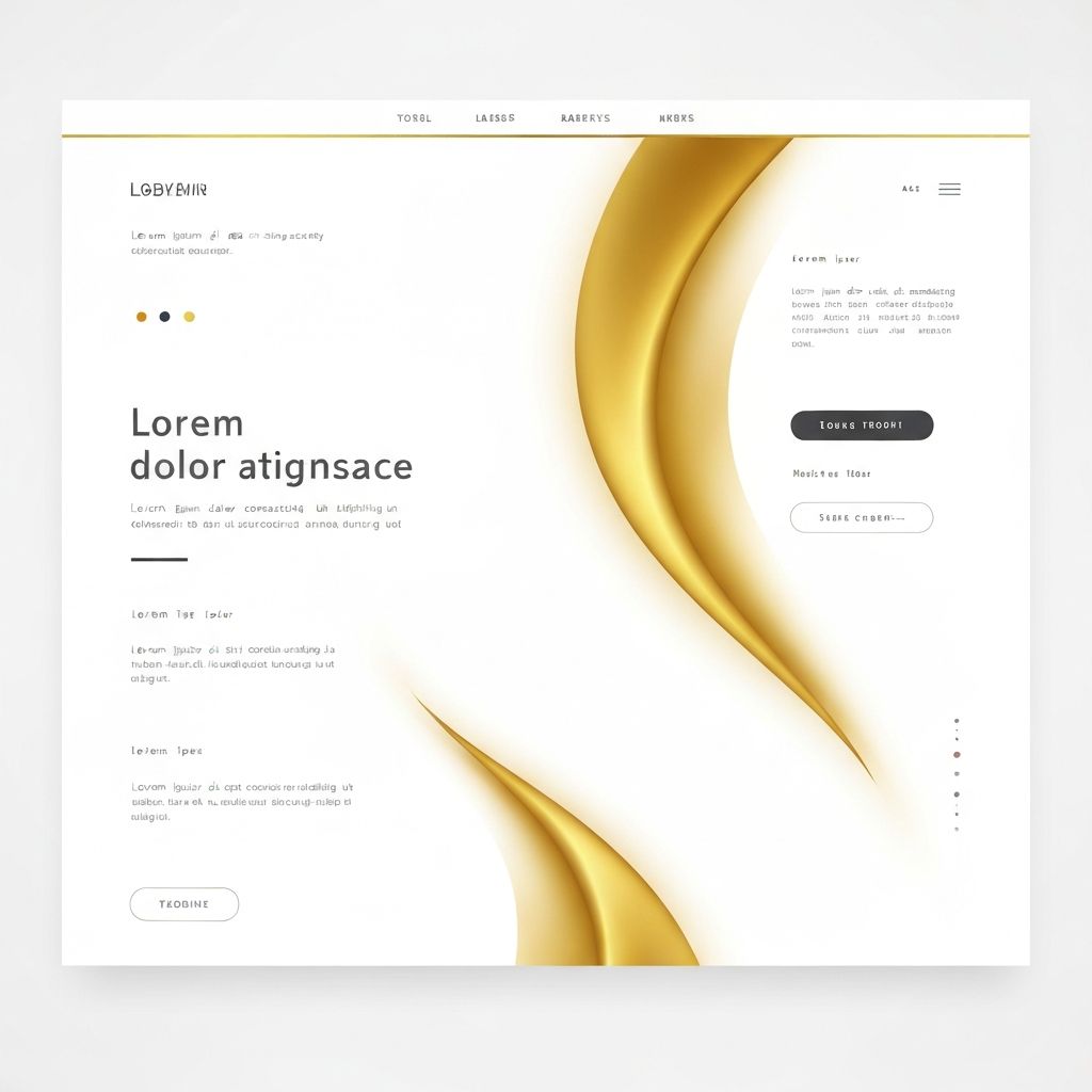
Hero Images and Full-Width Backgrounds
Massive hero images and full-screen video backgrounds dominated homepages in 2015. They communicated brand emotion in seconds and let businesses make a strong first impression. The trend pushed designers to invest in better photography and to think carefully about typography that could sit elegantly over imagery.
Ghost Buttons
Ghost buttons — transparent buttons with thin borders and minimal text — became hugely popular in 2015. They paired beautifully with hero images, kept the visual hierarchy clean, and felt understated and premium. While they have evolved since, the principle of subtle, elegant CTAs continues to influence modern design.
Card-Based Layouts
Inspired by Pinterest and reinforced by Material Design, card-based layouts surged in 2015. Cards organized diverse content into bite-sized, scannable units that worked perfectly on mobile. They became the foundation for blogs, e-commerce listings, dashboards, and social feeds — and they remain a staple of modern UI today.
Typography Takes Center Stage
2015 saw a renewed appreciation for bold, expressive typography. With web fonts widely supported and faster loading techniques available, designers used oversized headlines, custom fonts, and refined hierarchy to give websites distinct personalities. Typography became a design feature in its own right, not just a vehicle for words.
Microinteractions and Subtle Animation
Microinteractions — small animations that respond to user actions, like a button changing color or an icon morphing — gained traction in 2015. They added personality and feedback without overwhelming the experience. CSS animations and lightweight JavaScript libraries made them accessible to designers without heavy performance costs.
Lessons From 2015 That Still Apply
Many lessons from 2015 are still relevant. Mobile-first thinking, fast load times, clean typography, purposeful motion, and modular layouts have only grown more important. Trends like flat design, card UIs, and material principles evolved rather than disappeared. Businesses that learned to design for performance and clarity in 2015 had a head start on every trend that followed.
For sites still stuck in that era, modern Website Development can preserve what worked while upgrading speed, accessibility, SEO, and visual polish to today’s standards.
Final Thoughts
The web design trends of 2015 marked a shift from decorative design to user-centered, performance-focused design. Flat aesthetics, responsive layouts, bold imagery, and modular components set the stage for the next decade of web design. Revisiting those trends is a useful reminder that good design is timeless when it puts users first.
Want to publish a guest post on aamconsultants.org?
Place an order for a guest post or link insertion today.