How 2017 Reshaped the Web
By 2017, web design had matured beyond mobile responsiveness and into a new era of expression. Designers, freed from many earlier technical constraints, embraced bolder colors, asymmetric layouts, dramatic typography, and conversational interfaces. The year felt like a creative renaissance, with brands using websites not just to inform, but to make memorable emotional impressions.
Many of the ideas that emerged or peaked in 2017 still influence modern design — and understanding them sheds light on why today’s websites look the way they do.
Bring 2017 Inspiration to Today’s Standards with AAMAX.CO
Reimagining classic 2017 trends through a modern lens takes both creativity and technical know-how. Many brands collaborate with AAMAX.CO, a full-service digital marketing company offering web development, digital marketing, and SEO services worldwide. Their team blends striking visuals with high performance, delivering Website Design that feels both timeless and contemporary.
Bold and Expressive Typography
2017 was the year typography truly took center stage. Designers experimented with massive headlines, custom and variable fonts, mixed weights, and unexpected pairings. Type became a design element in its own right — sometimes filling an entire screen with a single statement. This trend pushed brands to develop stronger typographic identities that still define their websites today.
Asymmetric and Broken-Grid Layouts
For years, web design followed strict grids. In 2017, designers began breaking those grids on purpose. Asymmetric layouts, overlapping elements, and unconventional alignments added energy and editorial sophistication. When done with discipline, broken grids guided the eye in surprising, satisfying ways and gave websites a distinctive personality.
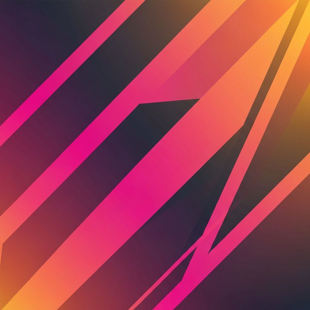
Vibrant Gradients Make a Comeback
After years of flat color dominance, gradients returned in 2017 — but bigger and bolder than ever. Apps like Instagram led the way with vibrant duotones and rainbow gradients, and websites followed. Gradients added depth, energy, and emotion to flat designs without sacrificing performance. They became powerful brand differentiators.
Cinemagraphs and Subtle Motion
2017 saw the rise of cinemagraphs — still photos with one moving element, like steam rising from a coffee cup or hair blowing in the wind. They captured attention without the bandwidth cost of full video. Combined with scroll-triggered animations and microinteractions, websites felt alive in a way static pages never could.
Custom Illustrations and Hand-Drawn Elements
To stand out from stock photography, brands invested in custom illustrations. Friendly, hand-drawn characters, abstract shapes, and unique iconography gave websites warmth and originality. This trend helped startups and SaaS companies in particular express complex products in approachable ways — a strategy that remains popular today.
Conversational Interfaces and Chatbots
Chatbots and conversational UI exploded in 2017. From customer support widgets to AI-powered assistants, websites started talking to users directly. Brands realized that conversation could replace long forms and dense FAQ pages, leading to faster, more human interactions. The groundwork laid in 2017 set the stage for today’s AI-powered chat experiences.
Mobile-First Becomes Mobile-Only Mindset
By 2017, mobile-first design was standard, but many teams went further — designing primarily for mobile and treating desktop as an enhancement. Hamburger menus, full-screen overlays, swipe gestures, and tap-friendly components shaped both phone and desktop experiences. The era cemented the principle that every interaction should feel natural on a touchscreen.
Sticky Elements and Smarter Navigation
Sticky headers, sticky CTAs, and floating action buttons became widespread in 2017. They kept key actions accessible during long scrolls and reduced friction on long-form pages. This functional trend continues to drive conversions today, especially on mobile devices where screen space is limited.
SVG, Animation, and Performance Awareness
SVGs replaced many raster icons and illustrations in 2017, allowing crisp visuals at any resolution and easy animation. CSS and JavaScript animation libraries matured, and designers became more conscious of performance budgets. The combination produced websites that were both visually rich and reasonably fast — a balance that defines modern Website Development to this day.
Lessons From 2017 That Still Apply
The biggest takeaway from 2017 is that personality matters. Websites that dared to be expressive — with bold type, brave layouts, vibrant colors, and human conversations — connected more deeply with audiences than safe, generic designs. The trend toward emotional, distinctive experiences has only grown stronger since.
Final Thoughts
2017 was a year of creative confidence in web design. It pushed the industry away from formulaic templates and toward expressive, brand-led experiences. Many of those ideas — strong typography, vibrant color, purposeful motion, and conversational UX — remain at the core of effective web design today. Studying 2017 is a reminder that great websites do more than function; they make people feel something.
Want to publish a guest post on aamconsultants.org?
Place an order for a guest post or link insertion today.