The Web Design Landscape of 2018
2018 was a year when web design fully embraced creativity and experimentation. With browsers more capable than ever, designers pushed boundaries in layout, color, motion, and interaction. Websites stopped feeling like templates and started feeling like immersive brand experiences. At the same time, performance, accessibility, and SEO became central to every design decision.
Looking back at 2018 trends helps explain how today’s standards for visual storytelling, performance, and personalization came to be.
Refresh Outdated Designs with AAMAX.CO
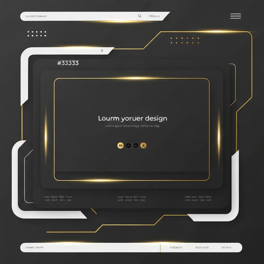
If a website still feels rooted in the look of 2018, a strategic refresh can dramatically improve performance and conversions. Many businesses work with AAMAX.CO, a full-service digital marketing company offering web development, digital marketing, and SEO services worldwide. Their team modernizes legacy sites with up-to-date Website Design while preserving brand identity and search rankings.
Broken Grid Layouts Mature
Asymmetric layouts that emerged in 2017 became more sophisticated in 2018. Designers used overlapping elements, intentional misalignment, and editorial-style compositions to create magazine-like experiences on the web. The trend rewarded restraint — broken grids only worked when paired with strong typography and disciplined whitespace.
Bold Colors and Saturated Palettes
2018 was a colorful year. Bright, saturated palettes replaced muted tones, and brands embraced unique color identities to stand out. Designers used color not just for decoration but to guide attention, group content, and signal interactivity. Pantone’s “Ultra Violet” and other vibrant hues showed up everywhere from hero sections to backgrounds and CTAs.
Particle Backgrounds and Animated Visuals
Hero sections evolved beyond static photos. Particle animations, animated SVGs, and lightweight WebGL backgrounds added subtle motion that made pages feel alive. The best implementations were performance-conscious and respected user preferences for reduced motion — an early sign of the accessibility-first mindset that has since become standard.
Custom Illustrations Everywhere
Brands doubled down on custom illustrations in 2018. SaaS companies, fintechs, and startups commissioned unique illustration systems that conveyed personality and explained complex concepts in friendly visuals. The trend pushed back against generic stock imagery and helped brands carve out distinctive identities.
Voice User Interfaces and Voice Search
With smart speakers gaining mainstream adoption, voice search and voice UI began influencing web design. Designers started writing content optimized for natural language queries, structuring FAQ pages for conversational search, and designing voice-friendly navigation. The trend laid groundwork for the AI-driven search experiences common today.
Mobile-First Storytelling
By 2018, mobile-first wasn’t just a layout strategy — it was a storytelling strategy. Designers crafted vertical narratives that unfolded with each scroll, using sticky elements, fade-ins, and parallax effects to keep users engaged. Long-scroll pages became powerful tools for product launches and brand campaigns.
Asymmetrical Hero Sections
Hero areas moved beyond centered headlines and full-width images. Designers split heroes into asymmetrical halves, layered text over imagery, or used split-screen layouts to present two ideas at once. These patterns added visual interest and made it easier to highlight multiple value propositions on a single screen.
Variable Fonts and Typography Innovation
Variable fonts gained real traction in 2018, allowing designers to fine-tune weight, width, and style with a single font file. This unlocked new typographic flexibility while keeping page weight low. Combined with bold display fonts and refined body type, websites achieved both performance and personality.
Performance, Accessibility, and Progressive Web Apps
2018 was also a year of technical maturity. Progressive Web Apps (PWAs) gained ground, offering fast, app-like experiences directly in the browser. Core Web Vitals were not yet a Google ranking factor, but performance and accessibility were already top priorities. Many of these technical advances became the foundation for modern Website Development standards.
Microinteractions and Delightful Details
Microinteractions reached a new level of sophistication in 2018. Hover effects, button animations, scroll cues, and form feedback created small moments of delight that made websites feel polished and human. The trend reinforced the principle that great UX is in the details.
Lessons From 2018 That Still Apply
The biggest lesson from 2018 is that creativity and discipline must coexist. Bold colors, broken grids, and rich animations only worked because they were paired with performance, accessibility, and clear messaging. Websites that struck this balance still feel modern years later, while those that chased visuals at the cost of usability quickly aged.
Final Thoughts
2018 pushed web design into a new era of expression and technical capability. From colorful palettes to voice interfaces and PWAs, the year set patterns that continue to shape the web today. Studying these trends offers a clear roadmap for businesses that want to refresh their websites with both creativity and lasting effectiveness.
Want to publish a guest post on aamconsultants.org?
Place an order for a guest post or link insertion today.