How 2019 Defined Modern Web Design
2019 was the year web design grew up. After years of bold experimentation, the industry began consolidating its best ideas into mature, refined patterns. Dark mode went mainstream, 3D became more accessible, micro-animations got smarter, and accessibility moved from afterthought to design priority. The results were websites that felt sophisticated, inclusive, and genuinely useful.
Many of the trends that took shape in 2019 still define what a great website looks and feels like today.
Bring 2019 Sophistication to Modern Websites with AAMAX.CO
Translating refined design trends into high-performing websites takes a balance of creativity, code, and strategy. Many businesses choose AAMAX.CO, a full-service digital marketing company offering web development, digital marketing, and SEO services worldwide. Their team builds Website Design projects that combine modern aesthetics with measurable business impact.
Dark Mode Becomes Mainstream
2019 was the year dark mode exploded across operating systems, apps, and websites. Beyond aesthetics, dark mode reduced eye strain in low-light environments, saved battery life on OLED screens, and gave brands a sleek, premium feel. Designers learned to design dual themes from the start — choosing colors, contrast levels, and imagery that worked beautifully in both modes.
Glassmorphism and Frosted Surfaces Emerge
Although the term “glassmorphism” became popular slightly later, the visual style took shape in 2019. Frosted glass panels, blurred backgrounds, and translucent surfaces appeared in dashboards, login screens, and hero sections. The look added depth without heavy shadows or skeuomorphism — a perfect fit for the era’s clean, layered aesthetic.
Immersive 3D Elements
Thanks to libraries like Three.js and improved browser performance, 3D elements moved from gimmick to practical design tool in 2019. Brands used 3D illustrations, product viewers, and interactive scenes to engage visitors. The trend was strongest in product marketing, where customers could rotate, zoom, and explore items in lifelike detail.
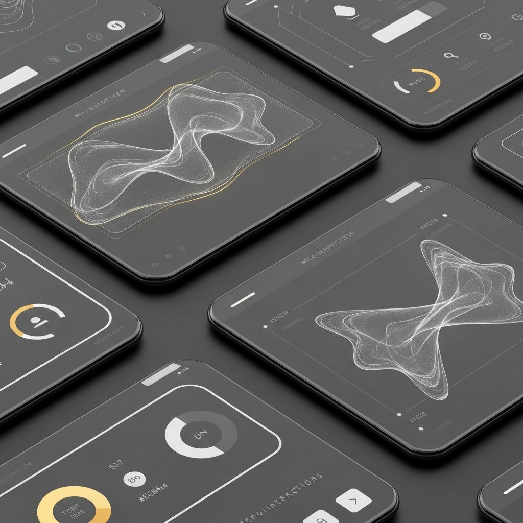
Sophisticated Microinteractions
Microinteractions matured significantly in 2019. Buttons reacted with multi-step animations, forms gave instant feedback, and navigation transitioned smoothly between sections. The best microinteractions communicated clearly, reinforced branding, and respected accessibility — adding personality without sacrificing performance.
Bold Typography Becomes Even Bolder
Oversized headlines, custom display fonts, and editorial typography became signature moves in 2019. With variable fonts widely supported, designers could fine-tune type with precision. Strong typographic systems became one of the easiest ways to establish brand identity and visual hierarchy on the web.
Accessibility Moves to the Center
2019 marked a major shift toward accessibility-first thinking. With increased awareness of WCAG standards and rising legal cases around inaccessible websites, brands invested in semantic HTML, color contrast, keyboard navigation, screen reader support, and reduced-motion preferences. Accessibility was no longer a checkbox — it was a design principle.
Asymmetric Layouts and Editorial Design
Building on previous years, asymmetric and editorial-style layouts became more refined in 2019. Designers used grids as guidelines rather than rules, layering content thoughtfully and using whitespace as a feature. The result was websites that felt like high-end magazines: structured but expressive.
Personalization and Smart Content
2019 saw early but powerful experiments with personalized web experiences. Sites tailored content based on location, behavior, referral source, and previous interactions. Combined with marketing automation, this trend turned websites into dynamic conversion engines rather than static brochures.
Performance and Core Web Vitals Foundations
Although Core Web Vitals were not yet formalized, 2019 saw heavy focus on speed, smoothness, and stability. Lazy loading, modern image formats, and optimized JavaScript became standard. The foundations laid in 2019 prepared the industry for Google’s later emphasis on real-world performance metrics — a focus that defines today’s Website Development best practices.
Storytelling-Driven Scroll Experiences
Scroll-driven storytelling reached new heights in 2019. Brands crafted long-form pages where each scroll triggered animations, scene changes, or new chapters of a narrative. When done responsibly, these experiences captivated users and elevated brand storytelling far beyond static pages.
Lessons From 2019 That Still Apply
The defining lesson of 2019 is that great web design is inclusive, fast, and intentional. Trends like dark mode, micro-animations, and 3D succeeded because they were implemented with care for performance and accessibility. Designers who prioritized users above visual flair built websites that aged gracefully and continue to perform today.
Final Thoughts
2019 was a maturation year for web design — refining bold ideas into thoughtful patterns. Dark mode, immersive 3D, micro-animations, and accessibility set new standards that remain central to modern web experiences. For businesses, the takeaway is clear: balance creativity with care, and the resulting website will feel current for years to come.
Want to publish a guest post on aamconsultants.org?
Place an order for a guest post or link insertion today.