Introduction
Typography is one of the most powerful tools in a web designer's kit. It carries voice, sets pace, and shapes how visitors perceive a brand long before they read a single sentence. Yet typography is often treated as an afterthought, leading to cluttered hierarchies, poor readability, and missed opportunities. When done well, type can guide attention, build trust, and turn casual browsers into engaged customers.
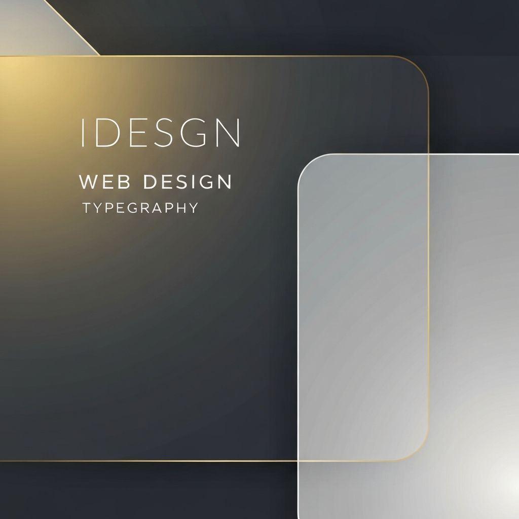
Hire AAMAX.CO for Type-Driven Web Design
If your site's typography feels inconsistent or uninspired, AAMAX.CO can help you establish a cohesive type system that reinforces your brand on every page. They build custom website design systems where typography, color, and layout work together, ensuring that headlines, body text, and interface labels all feel like they belong to the same family.
Why Typography Matters Online
On the web, around ninety percent of design is typography. Visitors spend most of their time reading, scanning, and interpreting text. Good type makes content easier to consume, reduces cognitive load, and signals professionalism. Bad type creates friction, increases bounce rates, and quietly undermines even the most beautiful imagery.
Choosing the Right Typefaces
Selecting typefaces starts with understanding your brand. Serifs often feel traditional, editorial, or trustworthy, while sans-serifs lean modern, friendly, or technical. Display fonts add personality but should be used sparingly. A common pattern is to pair one expressive display face with a highly readable workhorse for body text. Always test your choices on real content, real screens, and real users before committing.
Establishing Hierarchy
Hierarchy guides the eye. Use size, weight, color, and spacing to clearly differentiate headlines, subheads, body, captions, and interface text. A typical scale might include a hero headline, a section heading, a sub-heading, body copy, and small print. Stick to a limited set of styles so users learn your patterns quickly and content feels consistent across the site.
Readability and Line Length
Readability depends on more than font choice. Line length should usually sit between forty-five and seventy-five characters per line for comfortable reading. Line height around one and a half times the font size keeps paragraphs airy. Adequate contrast between text and background is essential, both for design polish and for accessibility compliance.
Variable and Web Fonts
Variable fonts have transformed web typography. A single font file can contain a full range of weights, widths, and slants, reducing payload while expanding creative possibilities. Designers can fine-tune type for specific viewports, animate weight on hover, or shift optical size between headlines and body. This flexibility supports responsive, performant, and expressive interfaces.
Responsive Typography
Type should adapt to the screen. Fluid typography uses CSS techniques such as clamp to scale font sizes between minimum and maximum values based on viewport width. This avoids tiny mobile headlines and oversized desktop body text. Pair fluid sizes with thoughtful line-height and spacing rules, and your site will feel right on any device.
Accessibility and Type
Accessible typography ensures everyone can read your content. Maintain sufficient contrast, never rely on color alone to convey meaning, and avoid all-caps for long passages. Provide adjustable text sizes where possible, and respect users' system preferences for reduced motion or high contrast. Accessible type is not a constraint, it is a quality marker.
Typography and Conversion
Typography directly affects conversion. Clear, scannable headlines help visitors understand value quickly. Readable body text builds trust. Confident calls to action, set in the right weight and size, drive clicks. Subtle adjustments to spacing, alignment, and emphasis can lift performance more than dramatic redesigns.
Final Thoughts
Typography deserves the same care as logos, color palettes, and photography. By choosing the right typefaces, building a clear hierarchy, and respecting readability and accessibility, you create a site that not only looks polished but also communicates with intention. Strong typography is invisible in the best way: visitors simply feel that everything makes sense.
Want to publish a guest post on aamconsultants.org?
Place an order for a guest post or link insertion today.