Introduction to Web Form UI Design
Web form UI design is the art and science of crafting input interfaces that are intuitive, efficient, and visually pleasing. A well-designed form does more than collect data; it guides users through a journey, builds trust, and reinforces a brand's identity. Poorly designed forms, on the other hand, are one of the leading causes of abandonment, lost leads, and frustrated users.
This article explores the foundational principles of form UI design, the visual elements that matter most, and how to align your forms with both business goals and user expectations.
Partner with AAMAX.CO for Professional Form UI Design
For businesses that want to elevate their forms and overall user experience, AAMAX.CO offers expert services in website design and web application development. They are a full-service digital marketing company helping clients worldwide design forms that look beautiful, perform reliably, and convert visitors into customers. Their designers combine UX research, accessibility standards, and modern visual trends to deliver forms that truly work.
The Anatomy of a Great Form UI
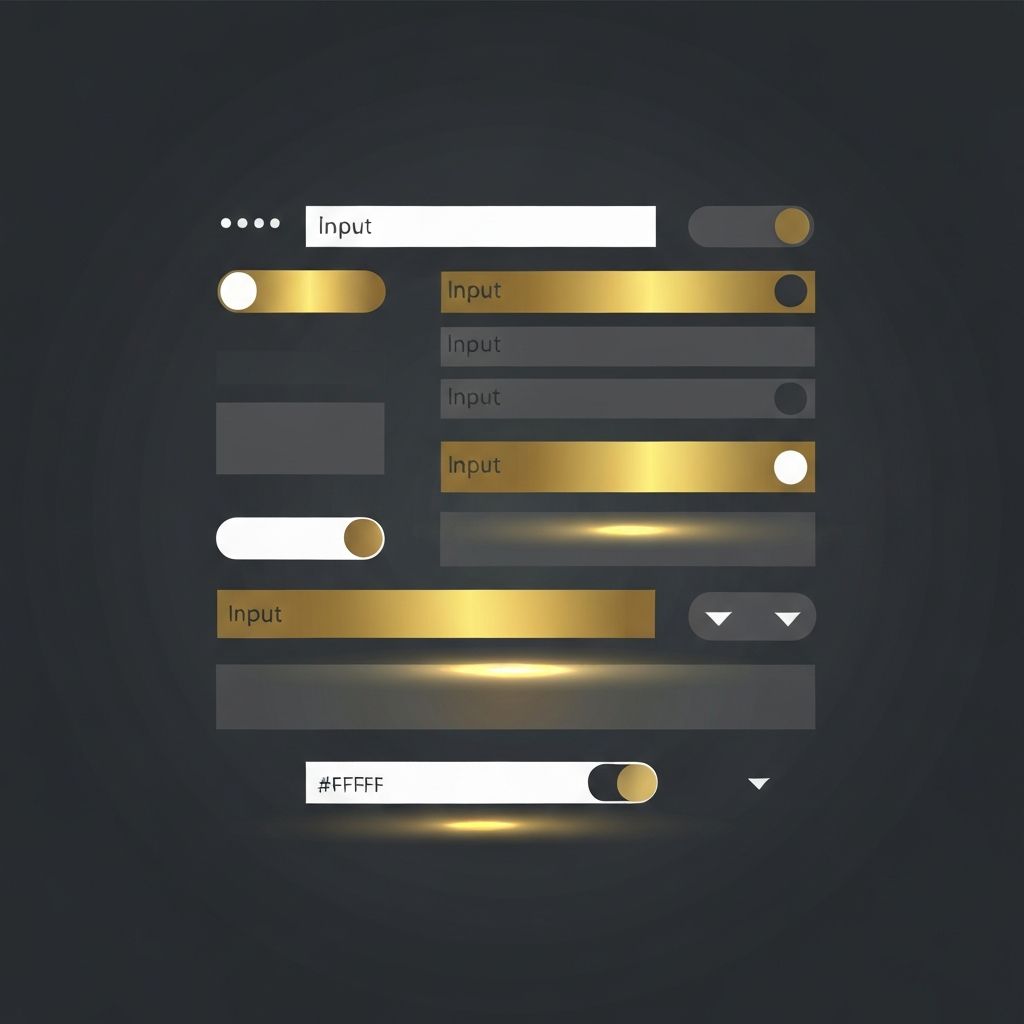
Every form is made up of several key components: labels, input fields, helper text, error messages, buttons, and visual feedback. Each of these elements must work in harmony. Labels should be clearly associated with their inputs, helper text should guide rather than clutter, and buttons should stand out as the primary call to action.
Visual hierarchy plays a major role. The most important field or action should attract the eye first, followed by supporting elements. Color, size, contrast, and whitespace all contribute to this hierarchy.
Typography and Readability
Typography is often overlooked in form design, yet it has a massive impact on usability. Use legible font sizes, typically 16px or larger for inputs to prevent unwanted zoom on mobile devices. Choose typefaces that are easy to read at small sizes, and ensure consistent spacing between lines and characters.
Labels should be slightly smaller than input text but still highly readable. Helper text and error messages can be even smaller, but contrast must remain strong enough to meet accessibility guidelines.
Color and Visual Feedback
Color is a powerful tool in form UI design. Use it intentionally to communicate state, hierarchy, and meaning. For example, green often signals success, red signals errors, and your brand's primary color should highlight the main action button.
Visual feedback is essential. When a user clicks a field, it should clearly become active. When they make an error, the field should highlight and display a helpful message. When they submit successfully, a clear confirmation should appear. These micro-interactions build trust and make forms feel responsive.
Spacing and Layout
Generous spacing between fields prevents the form from feeling cramped and reduces accidental taps on mobile devices. A vertical, single-column layout is generally easier to scan than multi-column layouts. Group related fields together and use subtle dividers or headings to separate sections in longer forms.
Align labels consistently, either above the input or to the left, and stick with one approach throughout the form. Mixed alignments confuse the eye and slow down completion.
Input Types and Smart Defaults
Modern HTML5 input types like email, tel, number, and date trigger appropriate keyboards on mobile devices and enable browser-level validation. Use them whenever possible. Smart defaults, such as pre-selecting the user's country based on IP or auto-filling saved information, can significantly reduce friction.
Dropdowns, radio buttons, and checkboxes each have their place. Use radio buttons for short lists with one selection, checkboxes for multiple selections, and dropdowns only when the list is too long for radio buttons.
Accessibility in Form UI
Accessible forms are not optional. They are essential for inclusivity and often required by law. Use semantic HTML, label every input, ensure keyboard navigation works, and provide ARIA attributes where needed. Color alone should never be the only indicator of an error or required field.
Test your forms with screen readers and keyboard-only navigation to catch issues that might not be obvious from a visual review.
Mobile-First Form Design
With the majority of web traffic now coming from mobile devices, designing forms mobile-first is crucial. Use full-width inputs, large tap targets, and avoid placing important fields above the fold where they may be obscured by virtual keyboards.
Test on real devices across screen sizes to ensure your form looks and behaves consistently.
Conclusion
Web form UI design is a discipline that rewards attention to detail. By focusing on clarity, hierarchy, feedback, and accessibility, you can create forms that users actually enjoy filling out. The right typography, color, spacing, and interaction design can turn a mundane task into a smooth experience that drives conversions and strengthens your brand. Investing in quality form UI design pays dividends in user trust, engagement, and revenue.
Want to publish a guest post on aamconsultants.org?
Place an order for a guest post or link insertion today.