Welcome to Web Page Design 101
If you are new to the world of building websites, web page design can feel overwhelming. There are dozens of tools, hundreds of trends, and thousands of opinions about what makes a page truly great. The good news is that the fundamentals have remained remarkably consistent over the years. Once you understand how layout, typography, color, imagery, and user experience work together, you will be able to create web pages that look professional and perform well, no matter what platform or framework you choose.
This 101 guide breaks down web page design into approachable concepts so you can start applying them on your very next project, whether you are designing for yourself, a client, or your own startup.
Hire AAMAX.CO to Bring Your Vision to Life
If learning everything yourself feels like too much, you can always hand the heavy lifting over to professionals. AAMAX.CO is a full-service digital marketing agency that offers complete Website Design and development solutions worldwide. They guide clients from initial concept through launch and ongoing optimization, so beginners and established brands alike can get a polished, conversion-ready website without having to master every detail themselves.
The Goal of Every Web Page
Before you choose colors or fonts, ask yourself one question: what is this page supposed to do? Every web page should have a clear primary goal, such as generating leads, selling a product, sharing information, or building credibility. Once the goal is defined, every design choice becomes easier because you can ask whether it supports that goal or distracts from it.
This goal-driven mindset separates beginner designs from professional ones. A pretty page that does not move users toward action is just decoration. A clear page that does move users is a business asset.
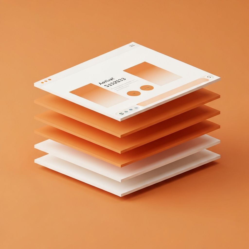
Layout and Visual Hierarchy
Layout is how you arrange elements on the page, and visual hierarchy is how you tell users what to look at first. Most successful web pages follow a simple structure: a clear header with navigation, a hero section with a strong headline and call to action, supporting sections that build trust and explain value, and a footer with secondary navigation and contact details.
Within each section, hierarchy is created through size, weight, color, and spacing. Headlines are large and bold, supporting text is smaller, and key actions stand out with contrasting colors. Grids and consistent spacing keep everything aligned and easy to scan.
Typography Basics
Typography is one of the most underrated tools in web page design. Choosing two complementary fonts, one for headings and one for body, is usually enough. Stick to web-safe or properly licensed web fonts, keep body text between 16 and 18 pixels for readability, and use generous line height to reduce eye strain.
Maintain a consistent type scale across the page. For example, define sizes for H1, H2, H3, body, and small text, and reuse them everywhere. This consistency makes your pages feel polished and intentional.
Color and Contrast
Color sets the mood and communicates personality. Beginners often use too many colors, which creates visual noise. A simple, effective palette includes one primary brand color, one or two accents, and a set of neutrals for text and backgrounds. Use accents sparingly to draw attention to important elements like buttons.
Contrast is critical for readability and accessibility. Body text should always have strong contrast against the background, and interactive elements like links and buttons should be clearly distinguishable. Tools that check contrast ratios can help you meet accessibility standards effortlessly.
Imagery, Icons, and White Space
Images and icons make pages more engaging when used purposefully. Choose visuals that reinforce your message rather than generic stock photos that add no value. Optimize image sizes for the web to keep your pages fast.
White space, the empty area around elements, is just as important as the elements themselves. It improves comprehension, draws attention to key content, and gives your design a premium feel. Do not be afraid of empty space; it is a powerful design tool.
The Web Design Workflow
Professional designers usually follow a clear workflow: research, wireframing, visual design, prototyping, development, and launch. Research uncovers what users need and what competitors are doing. Wireframes map structure without distractions. Visual design layers in branding and emotion. Prototyping lets you test interactions before code is written. Development brings everything to life, and launch is followed by analytics-driven improvement.
Even as a beginner, adopting this workflow will dramatically improve your results because you will think before you design and design before you build.
Final Thoughts
Web page design 101 is really about clarity, consistency, and care. Define your goal, structure your layout, choose typography and color thoughtfully, embrace white space, and follow a proper workflow. With these fundamentals in place, you will be well on your way to creating pages that are both beautiful and effective. And if you want a faster path to professional results, partnering with an experienced agency can help you skip the learning curve while still owning a brand-aligned, high-converting website.
Want to publish a guest post on aamconsultants.org?
Place an order for a guest post or link insertion today.