Introduction to Web Page Form Design
Forms are the bridge between your website and your business. They are how visitors sign up, contact you, place orders, give feedback, and complete countless other valuable actions. Web page form design directly impacts your conversion rates, user satisfaction, and ultimately your bottom line. Yet too many websites still treat forms as an afterthought, resulting in clunky, frustrating experiences that drive users away.
This article walks through the principles, patterns, and best practices that make web page forms effective, accessible, and enjoyable to use.
Hire AAMAX.CO for Conversion-Focused Form Design
If your website forms are underperforming, AAMAX.CO can help. They are a full-service digital marketing company offering website design and web application development services worldwide. Their team designs forms that combine clean visual design, intuitive UX, and conversion optimization techniques to maximize the value every visitor brings to your business.
Start with the Goal
Before designing any form, clearly define its purpose. Is it for lead generation, account creation, payment processing, or feedback collection? The goal determines what fields to include, how long the form should be, and what tone to use. A short newsletter signup needs minimal friction, while a B2B demo request might justify a few extra qualifying questions.
Always ask: what is the minimum information we need to accomplish this goal? Every additional field reduces conversion rates, so be ruthless in eliminating anything non-essential.
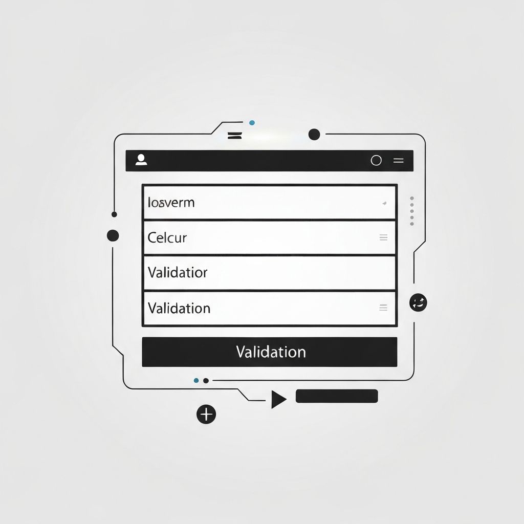
Layout and Structure
Single-column layouts are almost always the best choice for web forms. They create a clear top-to-bottom path, work well on mobile devices, and reduce cognitive load. Multi-column layouts can confuse users about which field to complete next.
Group related fields together. For example, name fields, address fields, and payment fields should each form their own visual cluster. Use whitespace, subtle dividers, or section headings to separate groups in longer forms.
Labels and Placeholders
Always use visible labels above or beside input fields. Placeholders alone are not enough; they disappear as soon as the user starts typing, leaving them with no reminder of what each field requires. Labels should be concise, descriptive, and free of jargon.
Use placeholders to provide examples or formatting hints, not as the primary label. For example, a phone field might have the label Phone Number and the placeholder (555) 123-4567.
Field Types and Input Optimization
Use appropriate HTML5 input types: email for email addresses, tel for phone numbers, number for numeric fields, and date for dates. These types trigger optimized keyboards on mobile devices and enable browser-level validation.
For longer text inputs, use textareas. For selecting from a few options, use radio buttons or checkboxes. Reserve dropdowns for longer lists where displaying all options would clutter the page.
Validation and Error Handling
Inline validation, where fields are checked as the user types or moves to the next field, is far more effective than validating only at submission. When errors occur, display clear, helpful messages near the offending field. Avoid generic messages like Invalid input; instead, explain exactly what went wrong and how to fix it.
Color, icons, and text should all work together to communicate errors. Never rely on color alone, as this fails users with color blindness.
Buttons and Calls to Action
Submit buttons should be visually prominent, with action-oriented labels. Replace generic Submit text with specific phrases like Create My Account, Get My Quote, or Start Free Trial. The button should clearly communicate what will happen when clicked.
If your form has secondary actions like Cancel or Save Draft, make them visually less prominent than the primary action to avoid confusion.
Progress Indicators for Long Forms
For multi-step or particularly long forms, progress indicators help users understand how much remains. Step indicators, progress bars, or section headings give a sense of accomplishment and reduce abandonment.
Save progress automatically when possible, so users do not lose their work if they navigate away or experience a technical issue.
Mobile Considerations
Design forms with mobile users in mind from the start. Use full-width inputs, large tap targets (at least 44x44 pixels), and avoid placing critical elements where the virtual keyboard might cover them. Test on real devices to catch issues that emulators miss.
Accessibility
Accessible forms are essential. Use semantic HTML, proper label associations, sufficient color contrast, and ARIA attributes where needed. Ensure the form can be completed using only a keyboard, and test with screen readers to verify a smooth experience for users with disabilities.
Conclusion
Web page form design is a powerful lever for improving conversion rates, user satisfaction, and business outcomes. By focusing on clarity, simplicity, validation, and accessibility, you can create forms that users actually want to complete. Small design improvements often lead to significant gains in conversions, making form design one of the highest-ROI areas of web development. Invest in your forms, and they will reward you many times over.
Want to publish a guest post on aamconsultants.org?
Place an order for a guest post or link insertion today.