The Rise of Card Design in Modern Web Design
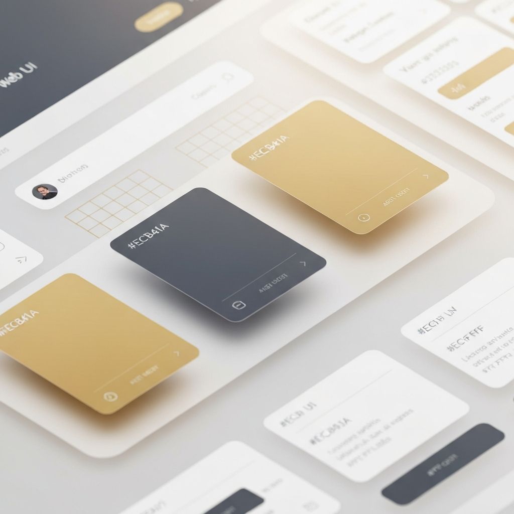
Card design has become one of the most influential UI patterns of the past decade. Popularized by platforms like Pinterest, Twitter, and Material Design, cards provide a clean, modular way to display content. Each card acts as a self-contained unit that groups related information — an image, title, description, and action — into a digestible package. This approach makes complex pages easier to scan, more visually appealing, and naturally responsive across devices.
Whether you are designing an e-commerce product grid, a blog archive, a dashboard, or a portfolio, card-based layouts deliver flexibility and consistency that few other patterns can match.
Hire AAMAX.CO for Modern Card-Based Web Design
If you want to leverage card design in your next project, AAMAX.CO is a full-service digital marketing company that excels in crafting modern, modular web experiences. Their designers and developers understand how to use card layouts to balance visual hierarchy, improve usability, and enhance conversions. They combine thoughtful UX research with refined visual design to deliver web interfaces that feel intuitive and look exceptional.
Why Cards Work So Well
Cards work because they mirror how our brains process information. By chunking related content together with consistent spacing, typography, and imagery, cards reduce cognitive load. Users can quickly scan a page, identify items of interest, and dive deeper without feeling overwhelmed.
Cards are also incredibly responsive. They naturally rearrange themselves into single columns on mobile, two or three columns on tablets, and multi-column grids on desktops. This adaptability makes them ideal for the multi-device world we live in.
Anatomy of a Great Card
Successful cards typically include a few key elements: a strong visual (image, illustration, or icon), a clear title, a brief supporting description, and a distinct call-to-action. White space and consistent padding give the card a clean, premium feel. Subtle shadows or borders separate cards from the background, creating a sense of depth.
Hover and tap states are equally important. A slight scale, shadow elevation, or color change signals interactivity and invites engagement. These microinteractions make the experience feel polished and modern.
Common Use Cases for Card Layouts
Card design is incredibly versatile. E-commerce sites use product cards to showcase items in grids. News and blog sites use article cards to highlight stories. Dashboards use stat cards to display KPIs. Portfolios use project cards to showcase work. Even social media feeds rely on card-like structures to organize posts.
The pattern can be adapted to almost any content type, which is why it has become a universal building block of modern web interfaces.
Design Best Practices
While cards are flexible, they must be used thoughtfully. Avoid overcrowding cards with too much text or too many actions. Maintain consistent dimensions across a grid to create visual harmony. Use a clear hierarchy within each card so users know where to look first. And ensure your cards are accessible — sufficient color contrast, focus states, and semantic HTML are essential.
Performance matters too. Cards often include images, so optimizing those assets, using lazy loading, and serving modern formats will keep your page fast and responsive.
Cards and Component-Based Development
Modern frameworks like React, Vue, and Svelte are perfectly suited for card-based design. A well-designed card component can be reused throughout the entire site, ensuring consistency and reducing development time. This component-driven approach also makes future updates and design changes far easier to implement.
Strong web application development practices help ensure these card components scale across complex applications without sacrificing performance or maintainability.
Conclusion
Card design is more than a passing trend — it is a foundational pattern in modern web design that solves real usability and layout challenges. When implemented with care, it creates interfaces that are beautiful, intuitive, and built to scale. Whether you are launching a new product, redesigning a website, or building an app, card-based design deserves a place in your toolkit.
Want to publish a guest post on aamconsultants.org?
Place an order for a guest post or link insertion today.