The Quiet Power of Simple Web Design
Simplicity in web design is often misunderstood. Many people equate it with minimalism, sparse layouts, or even boring aesthetics. In reality, simple web design is about clarity of purpose. Every element on the page exists for a reason, and anything that does not serve the user or the message is removed. The result is a website that feels effortless to use and effortlessly memorable.
Achieving genuine simplicity is one of the hardest challenges in design. It requires discipline, careful editing, and a deep understanding of what truly matters to the audience. The best examples of simple web design across the web reveal common principles that any business can learn from and apply.
Hire AAMAX.CO for Clean, Effective Web Design
If you appreciate the elegance of simple, conversion-focused websites, consider working with AAMAX.CO. They are a full-service digital marketing company offering website design services worldwide. Their team specializes in stripping away unnecessary clutter and crafting interfaces that communicate clearly, load quickly, and guide users naturally toward action.
What Makes a Web Design Truly Simple
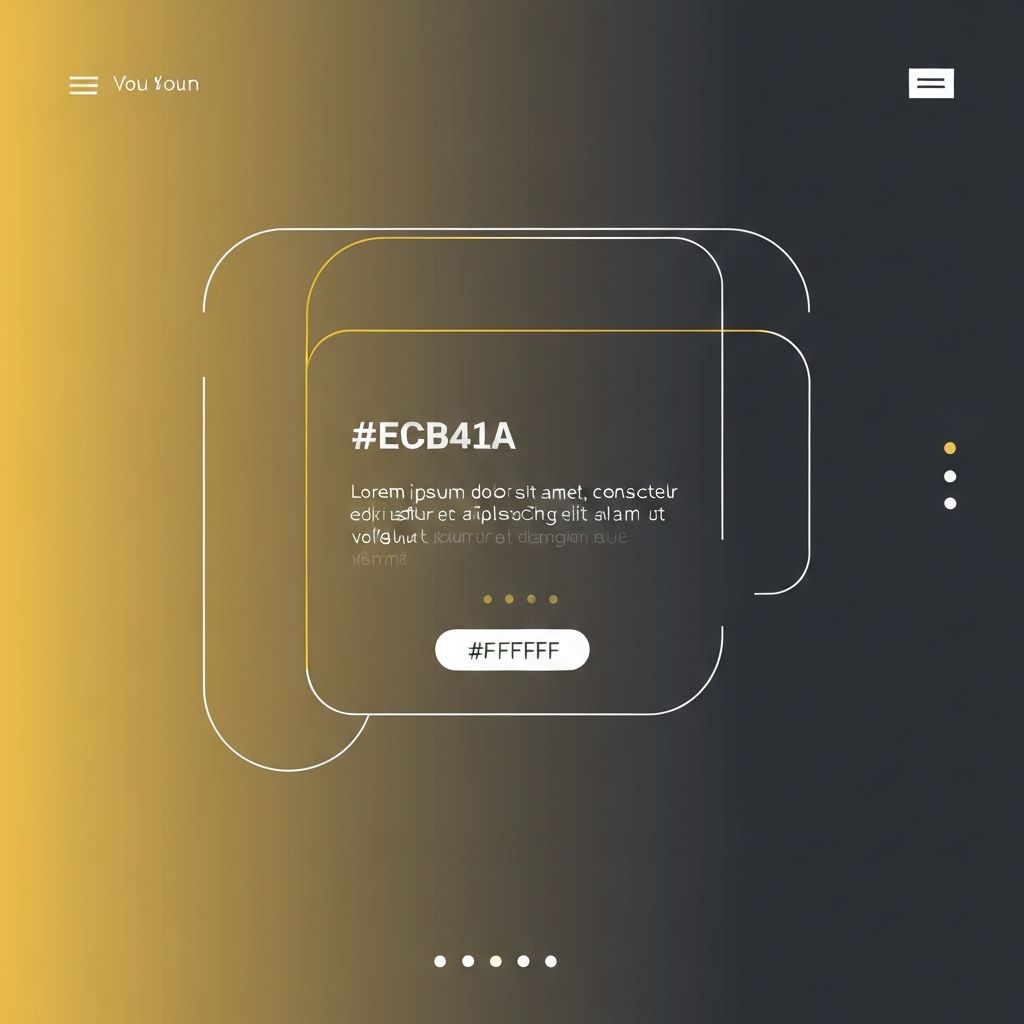
Simple web design is not about empty pages. It is about intentional choices. A simple homepage might still contain a hero section, a few key benefits, social proof, and a clear call to action. What makes it simple is the absence of visual noise: no rotating banners competing for attention, no five-step navigation menus, no random pop-ups disrupting the flow.
Visual hierarchy is another defining trait. The most important element on the page is also the most prominent. Secondary information supports the main message without competing with it. The eye knows exactly where to go and in what order, almost without thinking.
Examples Worth Studying
Apple's product pages are a frequent reference for simple web design. They use generous white space, large product imagery, and short, benefit-driven headlines. Each section focuses on a single idea, and transitions between sections feel natural. The overall effect is calm, premium, and persuasive.
Stripe's website is another classic example. Despite covering a complex topic like payment infrastructure, the design uses clean typography, subtle gradients, and well-organized documentation to make everything feel approachable. Developers and business owners alike find what they need without friction.
Smaller examples abound as well. Many independent studios, writers, and consultants use simple single-page designs that focus on a clear value proposition, a few testimonials, and a contact link. These sites prove that simplicity is not just for tech giants; it works at every scale.
Typography as a Design System
In simple web design, typography often does most of the heavy lifting. A carefully chosen typeface, used consistently, creates visual identity without the need for elaborate graphics. Pairing a strong display font with a readable body font, and limiting weights and styles, produces a polished and disciplined look.
Spacing matters just as much as the type itself. Generous line heights, well-chosen line lengths, and consistent margins between paragraphs make content easy and pleasant to read. When typography is treated as a system rather than an afterthought, the entire site feels more refined.
Color, Contrast, and Restraint
Simple websites usually rely on a restrained color palette. One or two primary colors, supported by neutral tones, are enough to create visual interest while maintaining clarity. Accent colors are used sparingly, often reserved for calls to action or key highlights.
Strong contrast ensures readability and accessibility. Dark text on light backgrounds, or light text on dark backgrounds, with sufficient contrast ratios, helps every user enjoy the experience. Subtle background tones can separate sections without resorting to heavy borders or dividers.
Navigation That Disappears Until Needed
Complex navigation menus are one of the biggest sources of visual clutter. Simple websites often use compact navigation bars with only a handful of essential links. Secondary pages can be reached through contextual links within the content itself, keeping the main menu focused and uncluttered.
On longer pages, smooth scrolling, anchor links, and progress indicators help users orient themselves. On mobile, a clean hamburger menu or a bottom navigation bar can replace traditional menus without sacrificing usability.
Performance as a Design Choice
Simplicity also benefits performance. Fewer images, lighter scripts, and cleaner code mean faster load times. Faster sites not only feel better to use but also rank higher in search results and convert more visitors. In this sense, simple design is also a smart business decision.
Optimizing images, lazy loading non-critical assets, and avoiding unnecessary third-party scripts all contribute to a snappier experience. The goal is a site that responds instantly to every interaction, reinforcing the sense of effortless quality.
Lessons You Can Apply
To bring simple web design principles into your own project, start by clarifying the single most important action you want visitors to take. Build the homepage around that goal, and remove anything that does not support it. Use one strong typeface, a limited color palette, and consistent spacing throughout.
Edit ruthlessly. If a section, image, or sentence does not earn its place, cut it. Test the site on real devices and watch real users navigate it. The feedback will reveal opportunities to simplify further, and each round of editing will make the design stronger.
Conclusion
Simple web design examples remind us that less is often more. By focusing on clarity, hierarchy, and intentional choices, designers can create websites that feel both elegant and effective. Simplicity is not a trend; it is a timeless approach that respects the user's time and attention. Embrace it, and your website will quietly outperform busier competitors year after year.
Want to publish a guest post on aamconsultants.org?
Place an order for a guest post or link insertion today.