The Rise of Tile-Based Web Design
Tile-based web design has become one of the most influential layout patterns of the past decade. Inspired by physical tiles and modern operating system interfaces, tile layouts arrange content in a grid of self-contained blocks. Each tile can hold an image, a snippet of text, a call to action, or even interactive elements. The result is a layout that feels organized, scannable, and visually rich without overwhelming the viewer.
This pattern works well across many types of websites, from portfolios and dashboards to e-commerce stores and news sites. It allows designers to communicate a lot of information in a compact, visually appealing way.
Hire AAMAX.CO for Modern Tile-Based Designs
Creating a tile layout that feels balanced and intentional requires design expertise. AAMAX.CO is a full service digital marketing company that offers website design services worldwide. Their designers know how to use tile and bento grid layouts to highlight key content, guide visitor attention, and create memorable visual experiences. They build modular interfaces that work beautifully on every device and adapt as content evolves.
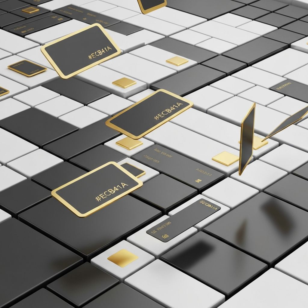
Why Tiles Work So Well
Tiles align with how people consume content online. Visitors rarely read every word on a page. Instead, they scan, jumping from one visual anchor to the next. Tile layouts cater to this behavior by breaking content into bite-sized pieces that are easy to digest at a glance.
The modular nature of tiles also makes them flexible. Designers can mix tile sizes, colors, and content types to create rhythm and emphasis. Larger tiles draw attention to priority items, while smaller tiles fill in supporting details.
The Bento Grid Approach
The bento grid takes tile-based design to a new level. Inspired by Japanese bento boxes, this layout arranges tiles of varying sizes into a cohesive composition. Each tile feels like a curated section of content, complete with its own visual style and purpose.
Bento grids are popular among tech companies, SaaS products, and creative agencies because they communicate complexity in an organized way. They can showcase features, statistics, testimonials, and case studies all on a single page without feeling cluttered.
Designing Effective Tiles
The success of a tile layout depends on the details. Each tile should have a clear purpose and a focal point, whether that is an image, a headline, or a piece of data. Visual consistency across tiles, such as matching corner radii and unified color palettes, helps the layout feel intentional rather than chaotic.
White space inside and around tiles is also important. It gives each tile room to breathe and prevents the design from feeling crowded. Subtle shadows or borders can further define the boundaries between tiles.
Responsive Tile Layouts
Tile layouts need to adapt gracefully to different screen sizes. On large desktops, tiles can be arranged in complex grids with varied sizes. On tablets, the grid often simplifies to two or three columns. On mobile, tiles typically stack into a single column for easy scrolling.
Modern CSS features like grid and flexbox make these responsive transitions smooth. Container queries take responsiveness further by letting individual tiles adapt based on their available space rather than the screen size alone.
Interactive Tiles and Hover Effects
Tiles invite interaction. Hover effects can reveal additional information, animate icons, or transition to different content. These micro-interactions make the experience feel polished and engaging, especially on desktop devices.
On touch devices, hover effects do not work the same way, so designers need alternative interaction patterns. Tap-to-expand tiles, swipeable carousels, or always-visible information are common solutions. The key is ensuring the design remains intuitive across input methods.
Tiles for Showcasing Content
Tiles excel at showcasing portfolios, products, and case studies. Each tile becomes a self-contained preview that links to a more detailed page. This pattern is especially effective for visual content like photography, design work, and product imagery.
For e-commerce, tiles can highlight product categories, featured items, or curated collections. The grid layout makes it easy for shoppers to browse and compare options without feeling overwhelmed by information.
Common Pitfalls to Avoid
Tile layouts can feel monotonous if every tile looks the same. Varying tile sizes, mixing content types, and using occasional accent colors can break up the grid and create visual interest. Without these variations, the design risks feeling like a wall of identical blocks.
Another pitfall is overloading tiles with too much content. Each tile should communicate one main idea. Cramming multiple messages into a single tile defeats the purpose of the layout and makes the content harder to scan.
Final Thoughts on Web Design Tiles
Tile-based web design is a powerful pattern for organizing content in a way that feels modern, scannable, and visually engaging. Whether implemented as a uniform grid or a creative bento layout, tiles help websites communicate efficiently and beautifully. By following best practices and keeping the user experience at the center, designers can use tiles to build interfaces that delight visitors and support business goals at the same time.
Want to publish a guest post on aamconsultants.org?
Place an order for a guest post or link insertion today.