Understanding Web Design Brutalism
Web design brutalism is a deliberately raw, unpolished aesthetic that rebels against the slick, templated look that dominates the modern internet. Inspired by the brutalist architecture movement of the mid-twentieth century, brutalist websites embrace stark layouts, harsh typography, exposed elements, and an almost confrontational simplicity. They look like they were built by hand, sometimes intentionally rough, often startling, and always memorable.
While brutalism is not for every brand, it has become an increasingly powerful tool for designers and businesses that want to stand out in a sea of pastel gradients and rounded corners. From cutting-edge fashion labels to indie magazines and tech startups, brutalist web design signals confidence, originality, and a refusal to follow the herd.
Hire AAMAX.CO for Brutalist Web Design Projects
If you want to push creative boundaries with a bold, unconventional website, AAMAX.CO can help bring your vision to life. They are a full-service digital marketing company offering custom website design and website development services that range from minimalist elegance to full brutalist expression. Their team understands how to balance daring aesthetics with usability, ensuring your brutalist site grabs attention without alienating users or sacrificing performance.
The Origins of Brutalism in Web Design
Brutalism in architecture emerged in the 1950s as a reaction against the ornate styles of the past. It embraced raw concrete, exposed structural elements, and honest material expression. Web design brutalism borrows the same philosophical spirit. It rejects unnecessary decoration, exposes the underlying structure of HTML, and treats the browser as a raw canvas rather than a glossy magazine page.
The movement gained traction in the mid-2010s as designers grew tired of cookie-cutter templates and bland minimalism. Sites like Bloomberg Businessweek, Drudge Report, and countless indie portfolios proved that ugly could be beautiful, and that breaking conventions could attract massive audiences.
Key Characteristics of Brutalist Websites
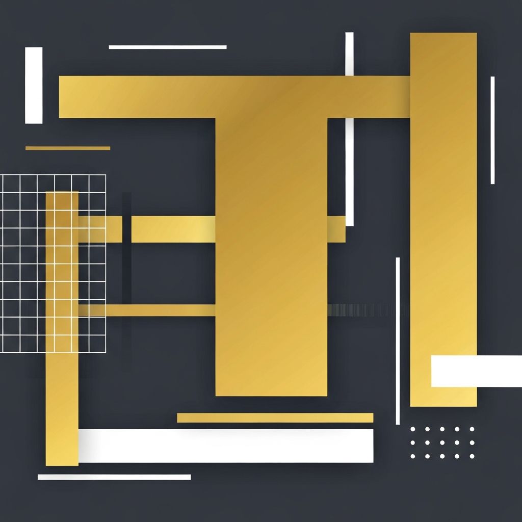
Brutalist sites share several recognizable traits. Default browser fonts, oversized typography, monochromatic or jarring color palettes, raw HTML elements, and intentionally awkward layouts are all hallmarks. Borders are thick and unapologetic, images often appear unedited or pixelated, and animations are minimal or absent.
Some brutalist sites lean into chaos with overlapping elements, broken grids, and unusual scrolling behavior. Others maintain a strict, almost archival simplicity that feels like a 1990s academic paper. Both approaches share the same underlying philosophy: function and honesty over decoration and polish.
When Brutalism Works
Brutalism is not appropriate for every brand. It works best when the audience is design-savvy, the brand has a confident point of view, and the goal is to differentiate sharply from competitors. Fashion houses, art galleries, music labels, indie publications, and creative agencies often benefit from brutalist aesthetics because their audiences appreciate the artistic statement.
Brutalism can also serve practical purposes. Stripped-down sites load incredibly fast, work on the slowest connections, and feel refreshingly direct in an era of bloated, overdesigned websites.
Balancing Brutalism with Usability
The biggest risk of brutalist design is sacrificing usability for aesthetic statement. A site that is impossible to navigate or read will lose visitors no matter how visually striking it is. Smart brutalist designers maintain strong information hierarchy, ensure adequate color contrast, and provide clear navigation even when the visual style is intentionally raw.
Test brutalist designs with real users. What feels boldly artistic to a designer might feel frustrating or amateurish to a typical visitor. Find the sweet spot where the aesthetic serves the brand without alienating the audience.
Typography in Brutalist Design
Typography is the heart of brutalist web design. Designers often use system fonts like Times New Roman, Helvetica, or Courier, embracing the default look of the web rather than fighting it. Massive headlines, tight letter spacing, and unconventional pairings of serif and sans-serif fonts create dramatic visual impact. Some designers push further with monospaced fonts, exaggerated kerning, or hand-drawn type that adds a personal, anti-corporate touch.
The Future of Brutalism
Brutalism continues to evolve as designers experiment with new tools and techniques. Neo-brutalism blends raw aesthetics with playful colors, soft shadows, and quirky illustrations. The movement has spawned countless variations, from clean brutalism to chaotic brutalism to brutalist minimalism. What unites them all is a commitment to authenticity, originality, and the courage to break the rules.
Final Thoughts
Web design brutalism is more than a passing trend, it is a sustained creative rebellion against the increasingly homogenized look of the modern web. Done well, it produces websites that are memorable, fast, and unmistakably original. Done poorly, it produces sites that confuse and repel users. The key is to embrace the philosophy of honesty and boldness while still respecting the fundamentals of usability and accessibility. Brutalism, at its best, reminds us that the web can still be a place of creative expression and rebellious individuality.
Want to publish a guest post on aamconsultants.org?
Place an order for a guest post or link insertion today.