The Comeback of Gradients in Web Design
For years, flat design dominated the web. Shadows were banished, textures were minimized, and gradients were considered relics of an earlier, less refined era. But design trends always evolve, and gradients have made a confident return. Today they show up everywhere, from billion-dollar brand identities to indie product launches, adding warmth, depth, and energy that pure flat design often lacks.
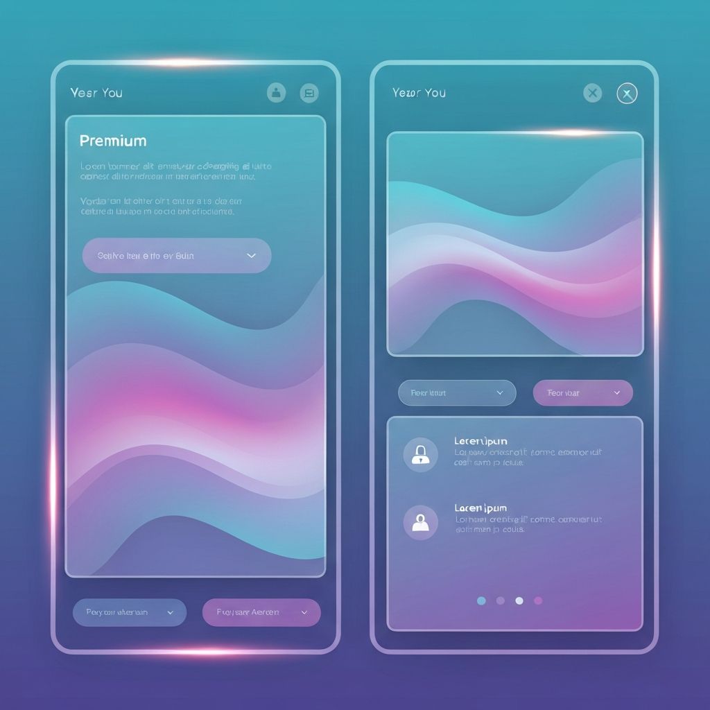
Modern gradients are more sophisticated than the harsh, glossy effects of the early 2000s. They lean on subtle color transitions, atmospheric blends, and carefully tuned palettes. Used well, they make interfaces feel alive without compromising clarity or usability.
Hire AAMAX.CO for Stunning Gradient-Driven Web Design
Designing with gradients well requires both artistic sensibility and technical precision. You can hire AAMAX.CO to craft visually rich websites that use gradients with intention and elegance. Their website design team understands how to balance bold visual direction with conversion-focused layouts, ensuring that every gradient serves a purpose rather than just decoration. From hero sections to background atmospheres to interactive button states, they know how to make gradients enhance the user experience instead of distracting from it.
Why Gradients Work So Well
Gradients add dimension. They simulate light, depth, and motion in ways that flat colors cannot. They draw the eye, signal hierarchy, and create memorable brand moments. Because gradients are continuous rather than fixed, they feel softer and more human, which is part of why so many SaaS, fintech, and lifestyle brands are embracing them again.
They also offer flexibility. A gradient can carry the spirit of a brand color while allowing for subtle variation across different surfaces, contexts, and devices. This makes them a powerful tool for systems where strict flat color rules feel limiting.
Types of Gradients to Consider
Linear gradients flow from one color to another in a straight direction and are the most common type used in web design. Radial gradients emanate from a central point and feel softer, often used for atmospheric backgrounds. Conic gradients rotate around a center, creating more sculptural effects ideal for illustrations and graphic accents. Mesh gradients blend multiple color points across a surface, producing rich, painterly results that have become a signature of modern design systems.
Choosing the Right Color Combinations
The most beautiful gradients use analogous colors that sit close together on the color wheel, such as blue to teal or orange to pink. Complementary colors can also work but require care, as harsh transitions through muddy middle tones can ruin an otherwise great design. Always check the midpoint of your gradient, not just the start and end colors, to make sure the transition feels intentional.
Consider mood as well. Cool gradients feel calm, professional, and trustworthy. Warm gradients feel energetic, friendly, and bold. Brand strategy should guide gradient direction just as much as it guides typography or imagery.
Using Gradients Without Overwhelming Users
Restraint is critical. A gradient on the hero, the call-to-action button, and the footer might be too much. Pick a few key surfaces where gradients can shine, and use solid colors elsewhere to give the eye a place to rest. Gradients work best when they contrast with calmer surroundings.
Pay attention to text contrast too. Light text on a soft gradient can become unreadable, especially on mobile devices in bright sunlight. Always test contrast ratios against the lightest and darkest points of the gradient to ensure accessibility.
Performance Considerations
Modern browsers render CSS gradients efficiently, so they rarely affect performance. However, large background images that simulate gradients can be costly to load. Whenever possible, use CSS gradients over image-based ones, and reserve image gradients for cases where mesh effects or hand-painted textures are required.
Animating Gradients Tastefully
Subtle gradient animations can add life to a website without distracting from content. Slowly shifting colors in a hero background, for instance, can create the impression of a living surface. Avoid fast or distracting animations, especially near text or interactive elements, and always offer a reduced-motion alternative for users who prefer it.
Final Thoughts
Gradients are not just a visual trend, they are a design tool with enormous expressive range. Used thoughtfully, they can elevate a website from forgettable to unforgettable. Used carelessly, they can make a site feel chaotic. The difference lies in restraint, color theory, and a clear vision for how each gradient supports your brand and your users.
Want to publish a guest post on aamconsultants.org?
Place an order for a guest post or link insertion today.