Why Web Page Design Dimensions Matter
Web page design dimensions are the foundation of every great digital experience. With users browsing on countless devices, screen sizes, and resolutions, choosing the right dimensions ensures your content looks balanced, professional, and easy to consume everywhere. A poorly sized layout can break trust within seconds, while a well-proportioned one drives engagement and conversions.
In 2026, responsive design is no longer optional. Designers must plan layouts that adapt fluidly across desktops, tablets, smartphones, foldables, and even ultra-wide monitors. Understanding standard dimensions and breakpoints is the first step toward building such future-ready websites.
Pixel-Perfect Designs from AAMAX.CO
Getting dimensions right requires both technical precision and design experience. AAMAX.CO is a full-service digital marketing company offering professional Website Design services worldwide. Their team builds responsive, pixel-perfect websites that look stunning on every device, helping businesses deliver consistent brand experiences without compromise.
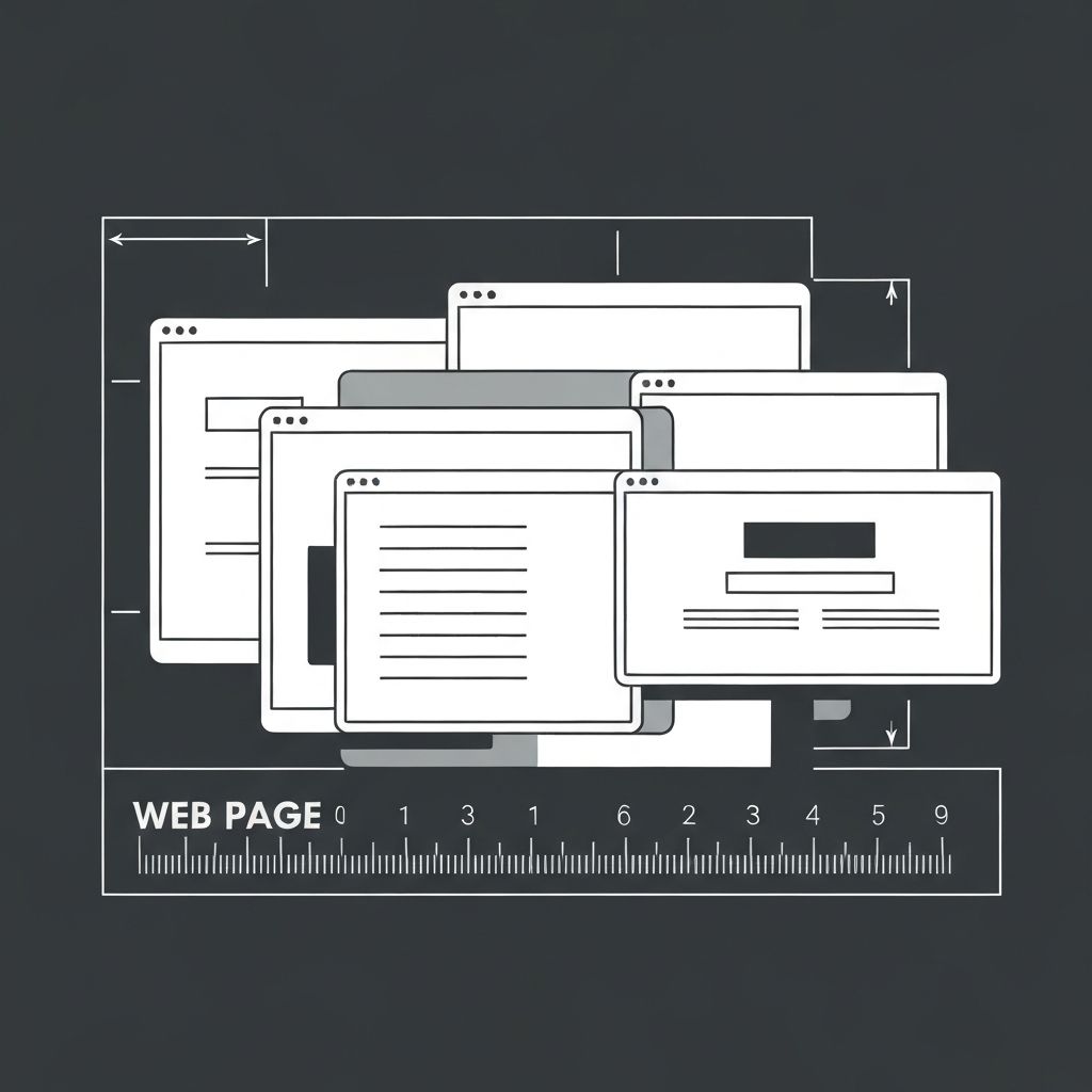
Standard Web Page Width and Layout Dimensions
The most common maximum content width for modern websites sits between 1200 and 1440 pixels, with full-width sections often using 1920 pixels for hero areas and backgrounds. Designers typically work on a 12-column grid system with gutters, allowing flexibility while maintaining visual harmony.
Inside this container, content widths often range from 720 to 960 pixels for optimal readability. Going wider can hurt readability, while too narrow a column wastes screen real estate. Balancing these widths is one of the core skills of an experienced web designer.
Common Breakpoints for Responsive Design
Breakpoints are specific screen widths where the layout adjusts to better fit the device. Common breakpoints in 2026 include around 1440 pixels for large desktops, 1024 to 1280 pixels for laptops, 768 to 1024 pixels for tablets, and 360 to 480 pixels for mobile devices. Some teams also add breakpoints for ultra-wide and foldable screens.
Rather than designing for specific devices, modern designers rely on fluid grids, flexible images, and CSS clamp functions to adapt layouts smoothly. The goal is to make the content flow naturally rather than jump abruptly between screen sizes.
Image and Banner Dimensions
Hero banners often span the full viewport width, with recommended dimensions around 1920 by 1080 pixels for desktops to support high-resolution displays. Inside content, blog featured images typically use a 16:9 ratio at around 1200 by 675 pixels for a balanced and modern look.
Thumbnails, product images, and avatars vary based on context, but consistency is key. Defining standard sizes for each image type within your design system avoids visual chaos and keeps the website looking polished across all sections.
Typography and Spacing Dimensions
Beyond layouts and images, typography dimensions strongly influence readability. Body text typically ranges between 16 and 18 pixels with line heights between 1.5 and 1.7. Headings scale up using a typographic ratio, creating clear hierarchy without overwhelming the reader.
Spacing between elements, like padding and margins, also follows systems based on multiples of 4 or 8 pixels. Consistent spacing rules give the entire website a clean, intentional rhythm, making it more enjoyable to navigate and visually professional.
Designing for High-Resolution and Mobile-First Screens
With Retina and 4K displays now common, designers must export images at 2x or 3x resolution to keep visuals crisp. SVGs and modern formats like WebP and AVIF further improve quality while keeping file sizes low and load times fast.
Mobile-first design has become the default approach. Designers start with the smallest screen and progressively enhance for larger ones. This ensures core content and interactions work flawlessly on phones, where most traffic comes from. Partnering with experts like the AAMAX.CO team can help you implement these dimension strategies effectively for long-term success.
Want to publish a guest post on aamconsultants.org?
Place an order for a guest post or link insertion today.