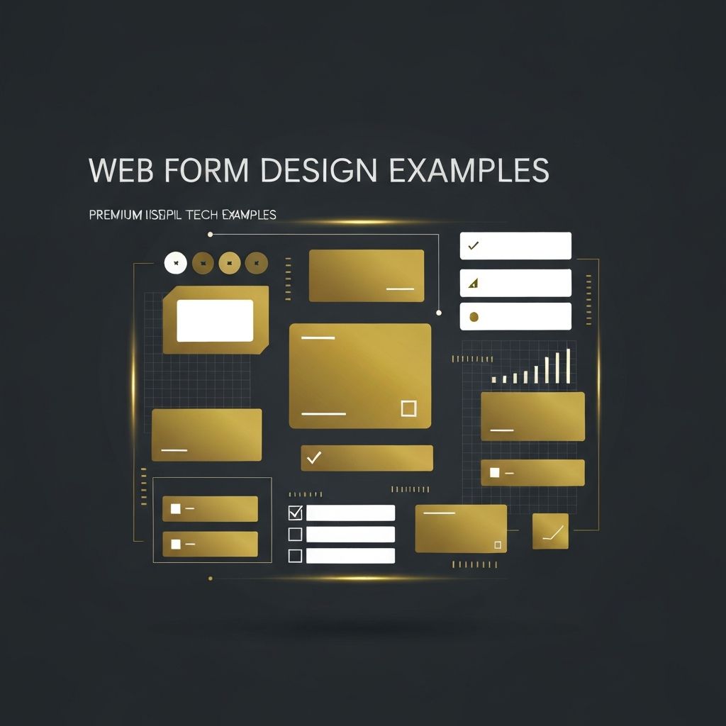
Introduction to Web Form Design Examples
Web forms are one of the most critical touchpoints between a business and its users. Whether it is a simple newsletter sign-up, a multi-step checkout, or a complex onboarding flow, the design of a form can directly impact conversion rates, lead quality, and overall user satisfaction. Studying real-world web form design examples helps designers and developers understand which patterns work, which fail, and how to balance aesthetics with usability.
In this article, we will look at standout examples of effective form design, break down what makes them successful, and share practical takeaways you can apply to your own websites and applications.
Hire AAMAX.CO for Expert Web Design and Development
If you are looking to build high-converting forms and beautifully crafted websites, AAMAX.CO is a trusted partner. They are a full-service digital marketing company offering website design, website development, and SEO services worldwide. Their team specializes in creating user-friendly, conversion-focused forms that align with brand identity and business goals, ensuring every interaction feels intuitive and seamless for end users.
1. Single-Column Sign-Up Forms
One of the most popular and effective form patterns is the single-column layout. Companies like Dropbox, Slack, and Notion use clean, vertical sign-up forms with minimal fields. The single-column approach reduces cognitive load by giving users a clear top-to-bottom path. Each field stands on its own, with generous spacing, large input boxes, and a visible call-to-action button at the bottom.
The takeaway: avoid multi-column forms unless absolutely necessary. They tend to confuse users, especially on mobile devices where horizontal space is limited.
2. Multi-Step Checkout Forms
E-commerce platforms like Shopify and Stripe Checkout demonstrate how breaking a long form into smaller, digestible steps improves completion rates. Each step focuses on one task such as shipping address, payment details, and review. A progress indicator at the top shows users how far they have come and how much is left.
This approach reduces overwhelm and gives users a sense of accomplishment as they complete each step. It also allows for better validation and error handling at each stage.
3. Inline Validation Forms
Inline validation, where users see instant feedback as they fill in each field, is another powerful pattern. Mailchimp, Google, and Airbnb all use inline validation effectively. As soon as a user types their email, the form checks formatting and highlights errors in real time.
This reduces frustration at submission time, when users would otherwise have to scroll back through the form to fix multiple issues at once.
4. Conversational Forms
Typeform pioneered the conversational form style, where each question appears one at a time, almost like a chat. This approach feels personal and engaging, making users more likely to complete long surveys or onboarding flows. The animations, large typography, and friendly tone all work together to create a delightful experience.
Conversational forms work especially well for lead generation, customer feedback, and quizzes.
5. Smart Default and Auto-Fill Forms
Modern forms leverage browser auto-fill, smart defaults, and progressive disclosure to minimize the work users have to do. Apple, Amazon, and Google use auto-detected addresses, saved payment methods, and pre-filled fields whenever possible. This dramatically speeds up form completion and reduces drop-off rates.
6. Floating Label Forms
Material Design popularized floating labels, where the label sits inside the input field and floats above it as the user starts typing. This pattern saves space, looks modern, and keeps the label visible at all times. However, it must be implemented carefully to maintain accessibility and clarity.
Key Lessons from Great Form Design Examples
After studying these examples, several universal principles emerge:
Keep it short: Only ask for what you truly need. Every extra field reduces conversion rates.
Use clear labels: Avoid jargon and make sure each label explains exactly what is required.
Provide instant feedback: Inline validation, helpful error messages, and success states guide users smoothly.
Optimize for mobile: Use large tap targets, appropriate input types, and avoid horizontal scrolling.
Design for accessibility: Ensure proper contrast, keyboard navigation, screen reader support, and ARIA attributes.
Conclusion
Great web form design is a blend of psychology, usability, and visual design. By studying examples from industry leaders and applying proven patterns, you can dramatically improve conversion rates and user satisfaction. Whether you are designing a simple contact form or a complex multi-step checkout, focus on clarity, simplicity, and feedback. With the right approach and the right partner to bring your vision to life, your forms can become powerful drivers of business growth.
Want to publish a guest post on aamconsultants.org?
Place an order for a guest post or link insertion today.