The Power of Whitespace in Web Design
Whitespace, also known as negative space, is the empty area between elements on a webpage. Far from being wasted real estate, whitespace is one of the most powerful tools in a designer's toolkit. It improves readability, directs attention, conveys luxury and sophistication, and helps users focus on what matters most. Some of the world's most successful brands, including Apple, Google, and Stripe, lean heavily on whitespace to create clean, premium digital experiences.
Mastering whitespace is essential for any designer who wants to create websites that feel modern, professional, and effortless to use.
Hire AAMAX.CO for Clean, Premium Web Design
If you want a website that leverages whitespace masterfully, you can hire AAMAX.CO. They are a full-service digital marketing company offering web development, digital marketing, and SEO services worldwide. Their design team understands the balance between content and breathing room, crafting elegant interfaces that guide users naturally toward conversion. They combine strong typography, intentional spacing, and thoughtful hierarchy to create sites that look beautiful and perform exceptionally well.
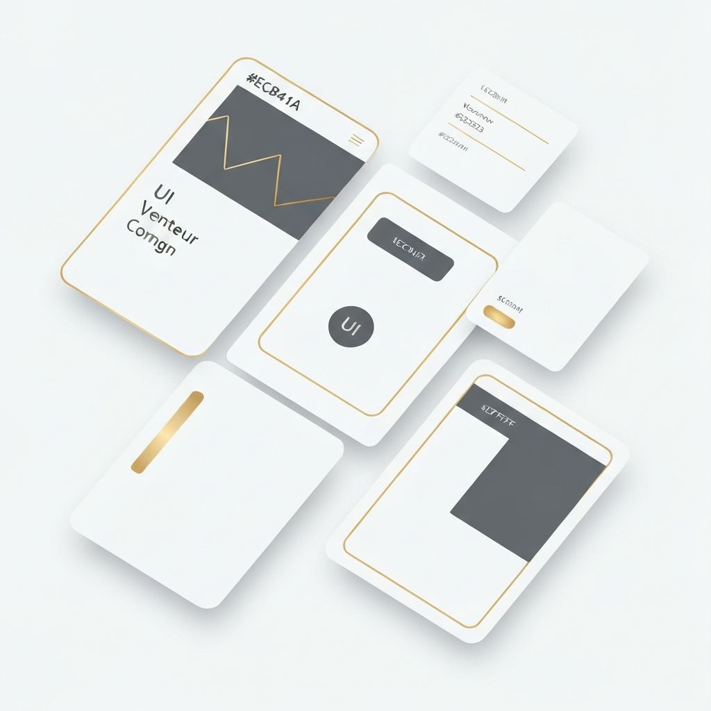
Types of Whitespace
There are two main types of whitespace. Macro whitespace refers to the large spaces between major sections, columns, and elements such as headers and footers. Micro whitespace is the smaller spacing between letters, lines, list items, and buttons. Both are critical to a successful design.
Macro whitespace creates structure and rhythm. Micro whitespace improves legibility and gives interactive elements room to breathe, making them easier to tap or click on mobile devices.
Why Whitespace Improves User Experience
When a website is cluttered, users feel overwhelmed and often leave without taking action. Whitespace reduces cognitive load by separating content into digestible chunks. It improves scanning, helps users find what they need, and creates a sense of calm. Research from Crazy Egg and Nielsen Norman Group consistently shows that increased whitespace correlates with higher comprehension and engagement.
Effective website design uses whitespace strategically to highlight calls to action, guide users through funnels, and create focal points that drive conversions.
Whitespace and Brand Perception
The amount of whitespace on a site directly affects how users perceive the brand. Generous spacing communicates luxury, professionalism, and confidence. Tight, cluttered layouts often feel cheap or rushed. This is why high-end brands almost always use airy, minimal designs while discount retailers often pack in as much content as possible.
Choose your spacing strategy based on your brand positioning and audience expectations. A luxury fashion site requires very different spacing than a daily deals website.
Typography and Whitespace
Typography and whitespace are inseparable. Line height, letter spacing, paragraph spacing, and margins all affect readability and visual rhythm. A common mistake is cramming text together to fit more content on a page. This usually backfires, as users abandon walls of text quickly.
Aim for line heights of 1.5 to 1.7 times the font size for body text. Use generous paragraph spacing and limit line lengths to about 60 to 75 characters for optimal readability.
Whitespace in Mobile Design
On mobile devices, whitespace becomes even more important. Smaller screens leave less room for elements, so every pixel of spacing must be intentional. Tap targets need adequate padding so users can tap accurately without hitting adjacent elements. Sections need clear separation so users can scan content while scrolling.
Modern website development frameworks make it easy to implement responsive spacing systems that adapt to different screen sizes while maintaining visual hierarchy.
Common Whitespace Mistakes
Many designers underuse whitespace because clients ask them to fit more content above the fold. This is usually a mistake. Crowded designs perform worse, even if they technically display more information. Other mistakes include inconsistent spacing across pages, ignoring mobile spacing, and using tight line heights that hurt readability.
Establish a spacing scale early in your design process and stick to it. Tools like Figma, Sketch, and Tailwind CSS make it easy to maintain consistent spacing across an entire project.
Whitespace in Web Applications
Even data-heavy web applications benefit from intentional whitespace. Dashboards, admin panels, and SaaS products often display dense information, but well-spaced layouts make complex data far easier to understand. Use whitespace to separate sections, group related information, and reduce visual fatigue for users who spend hours in the application.
Conclusion
Whitespace is not empty. It is essential. Mastering negative space transforms cluttered, confusing websites into elegant, focused experiences that delight users and drive results. Embrace whitespace as a design tool, not a waste of space, and your websites will look more modern, perform better, and feel more premium to every visitor.
Want to publish a guest post on aamconsultants.org?
Place an order for a guest post or link insertion today.