Gone are the days when flier advertising was the only method to increase sales. It’s 2024 when websites & online marketing have become a great fad. Thus, while designing websites, we must be very conscious about the elements we want to incorporate. From color schemes to whitespaces, everything affects the sales.
Helpful link: Top 10 Web Development Companies in Pakistan
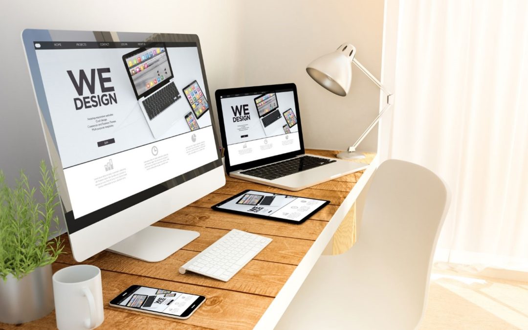
Top 10 Website Design Tips
Tip #1: Visual Appeal
A few days back, I decided to shop online, but I couldn’t determine which shopping platform should be used. I thought of exploring it all. I tried Amazon & Flipkart. But I was not impressed with the visuals. At last I surfed Myntra. Its visual appeal was so fantastic that I shopped for many clothing items there. Such is the importance of visual appeal.
Moral of the Story: If your website is visually appealing, the bounce rate will decrease & the conversion rate will increase.
Tip #2: Clutter-Free Design
Don’t put too much text on your website. It will confuse the users, and they won’t read it all. Viewers don’t prefer to keep on reading text throughout their web visits. Allow them to look at the graphics & videos as well.
Tip #3: Creative & Simple Text
You must have hired content writers to write great pieces of content for you. You must instruct them to be straightforward with their writing as not every visitor is intellectual & able to understand what you have written. It is observed that the websites with creative text impress the visitors. Don’t be too straightforward with your text. Include some emotions, some catchy words & do some wordplay.
Tip #4: No Stock Images
Yesterday, I was scrolling through quora. I saw a question that read, “How to increase sales through web design?” A reputed SEO executive answered it in the following words, “Be original. Don’t use stock images. I have experimented with both these things, and unsurprisingly, the traffic at my website skyrocketed immediately after I used original images.”
Tip #5: Pass The Blink Test
There is a term called “Blink Test”. According to this test, “If your website can communicate with the visitors before they blink, then that visitor is sure to turn into a hot lead or a potential customer probably.” To pass the blink test, you need to emphasize the following:
- Use the business-relevant graphic above the fold
- The graphic must have a catchy tagline that tells ‘What your business is all about
Tip #6: Use Eye Soothing Colors
You may have a good screen that shows the colors perfectly. But not everybody has high-resolution display screens, and harsh or aggressive colors may disturb their eyes & consequently, they may wish to leave. So it is always suggested to use light & eye-soothing colors.
Noteworthy Conclusions:
- Bright & Aggressive colors may increase bounce rate.
- Websites with lousy color themes are not preferred by google either.
Tip #7: Don’t Use Too Many Font Styles
Be consistent with your font styles. Don’t use too many font styles. Make sure you are choosing and being with it. Choosing too many font styles can confuse the readers and appear horrible.
Tip #8: Follow The Storytelling Approach
Make sure you are adding a section per your company’s historical story.
- Header with Heading & Subheading (That explains which services your company provides)
- About Your Business (Starting Year, How you decided to establish this company)
- Services You Provide (In Detail)
- Your Accomplishments Till Time
- Feature Some of the Best Projects (Choose the number as per layout)
This is the series that is proven to work. Now imagine if you break this series and add sections randomly like this:
- Header with Heading & Subheading (That explains which services your company provides)
- Your Accomplishments Till Time
- Services You Provide (In Detail)
- Feature Some of the Best Projects (Choose the number as per layout)
- About Your Business (Starting Year, How you decided to establish this company)
Does it make any sense? I don’t think so!
So the correct series of sections always matter. It is the main feature of the storytelling approach.
Tip #9: Case Studies Tab is Mandatory
Your portfolio can be highlighted very well with the addition of a case studies section. It must feature all the reputed projects that you have worked with and delivered valuable results. Make sure you are designing case study pages comprehensively so the visitor can have in-depth information about how you tackle the projects of a particular niche.
Conclusion
Website Design can either be a hero or a villain for your business. A well-designed website always gains high profits compared to the one created just for the sake of having a website.